Four years in the making
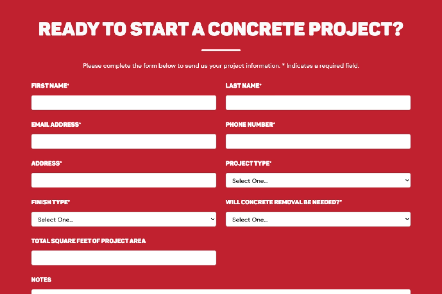
Pro Concrete Services had a website, but it wasn't working as a business tool. Two separate forms confused the conversion path, an estimate form buried at the bottom of the homepage gave users no reason to stay, and required fields asking for project measurements and finish types created friction at the exact moment users were ready to reach out.
The 2026 redesign focused on one goal: turning visitors into leads. That meant simplifying the conversion path to a single estimate form, rewriting copy from company-focused to customer-focused, and rebuilding the site architecture in Webflow with CMS-powered service pages, service areas, and project galleries to support organic search performance.
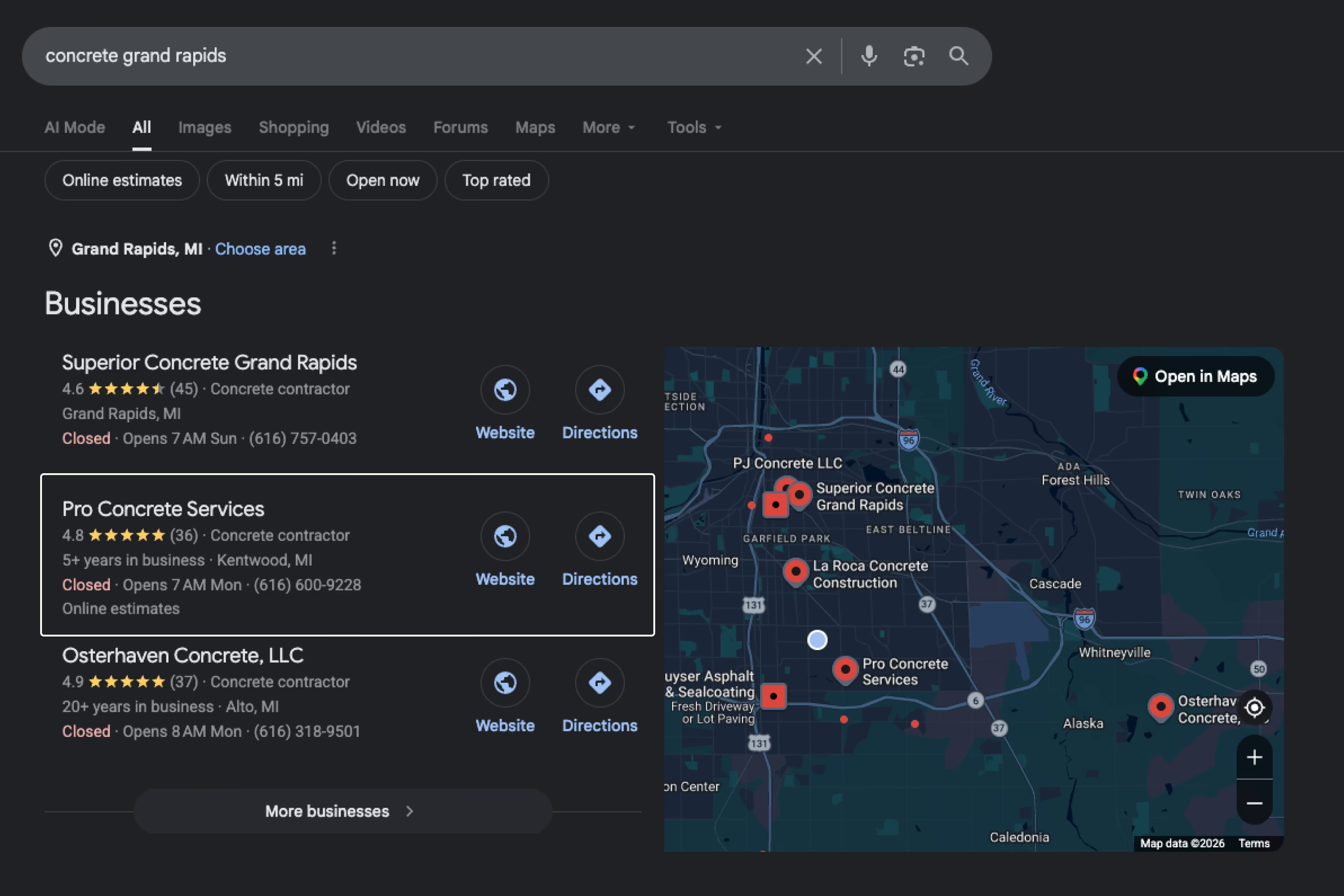
The result is a site that ranks first in the local business pack for high-intent keywords like "concrete Grand Rapids," drives consistent form submissions throughout concrete season, and gives a one-person operation the digital presence to compete with established contractors.
A site working against itself
The old site had four years of decisions made without a design system. Inconsistent typography, unoptimized images, a background video that tanked page speed, and two separate contact forms with no clear conversion path were the most visible problems.
The estimate form was the biggest friction point. Four required fields asked users to measure their project before speaking to anyone. A full year of form submission data confirmed it: 90% of users selected "undecided" for finish type, a field removed entirely after confirming the client's estimators collect that information during the initial consult.
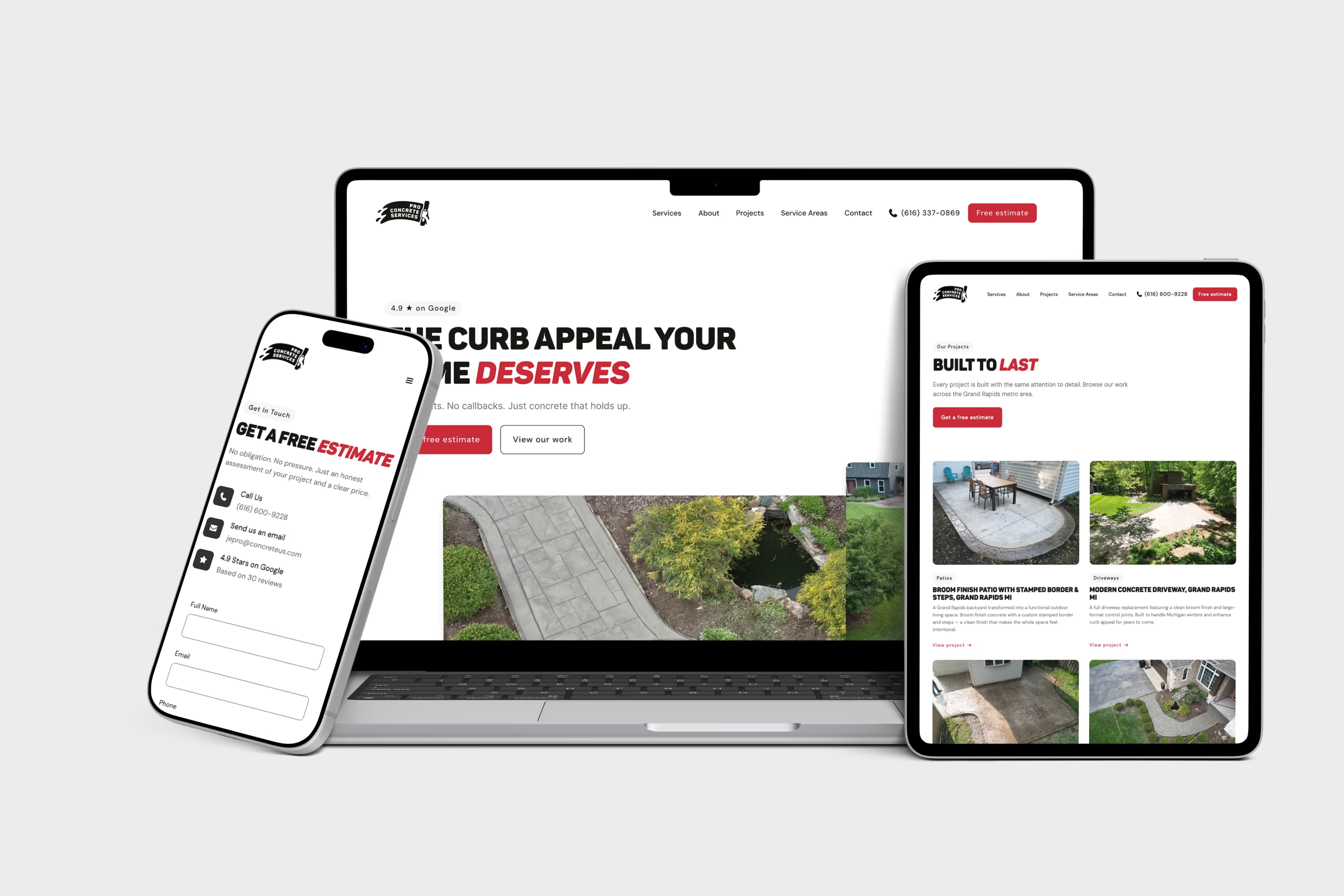
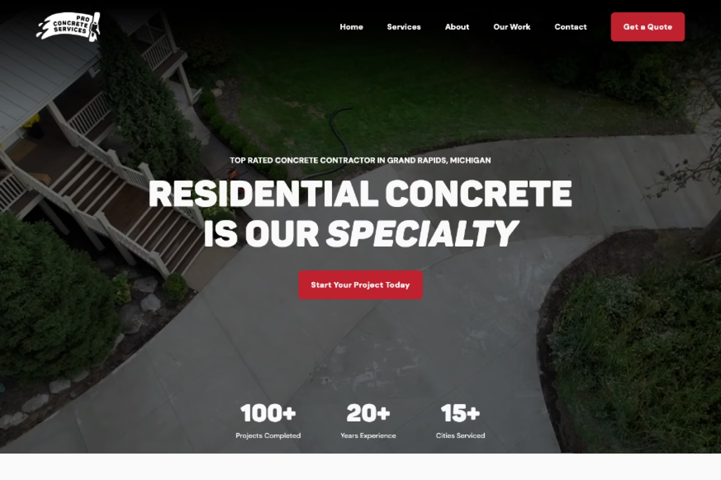
The copy told the company's story instead of the customer's. The original hero led with "Residential Concrete Is Our Specialty." The redesigned hero leads with "The Curb Appeal Your Home Deserves." That shift runs through every page of the new site.
Every decision earned its place
Showing all services, not teasing them
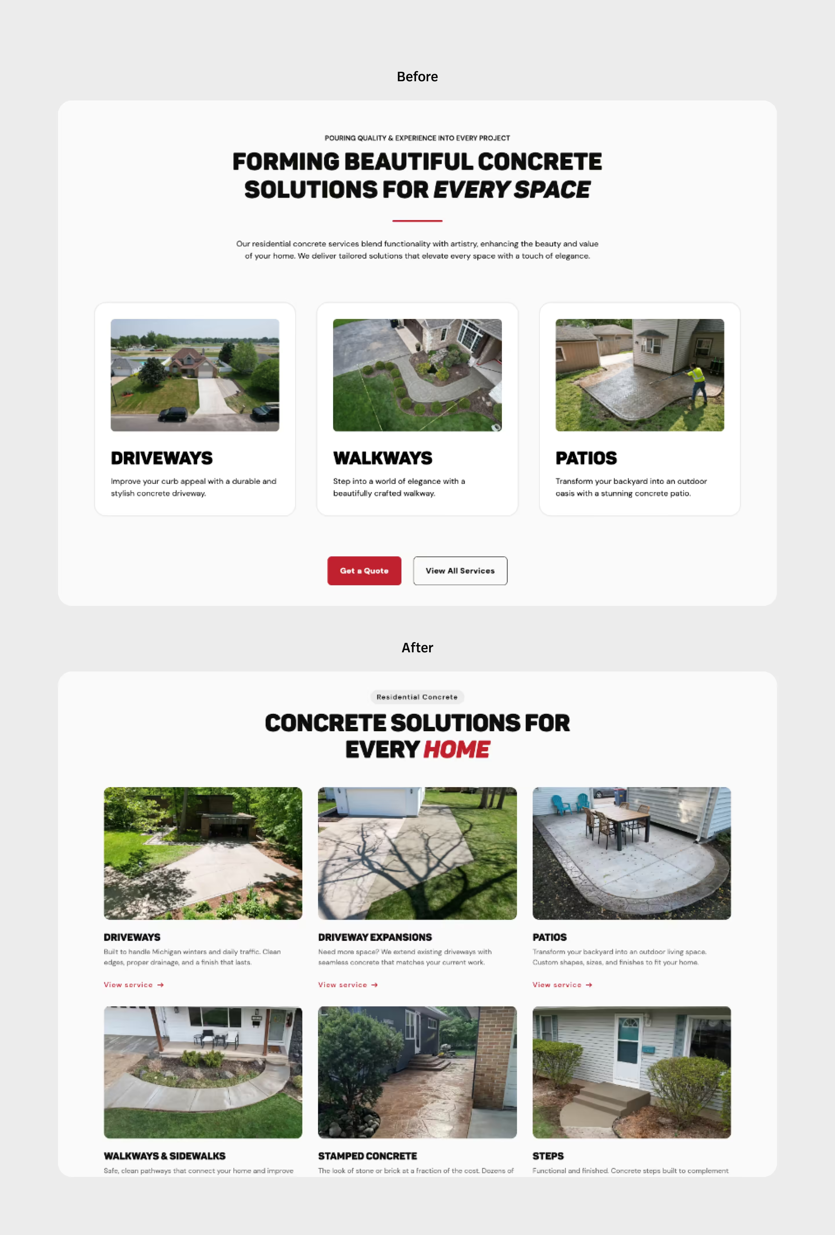
The original site showed only three services with a "View All Services" CTA, an intentionally minimal approach meant to create curiosity. In practice it hurt both SEO and usability. Search engines couldn't index services that weren't visible on the page, and users wanted to see the full picture without navigating away. This led to a 3x3 grid on desktop (list on mobile) of nine services on the homepage, removing Pool Areas and Basketball Courts due to limited project examples, and adding Concrete Repair as a service with stronger demand.
Rebuilding the project gallery around the best work
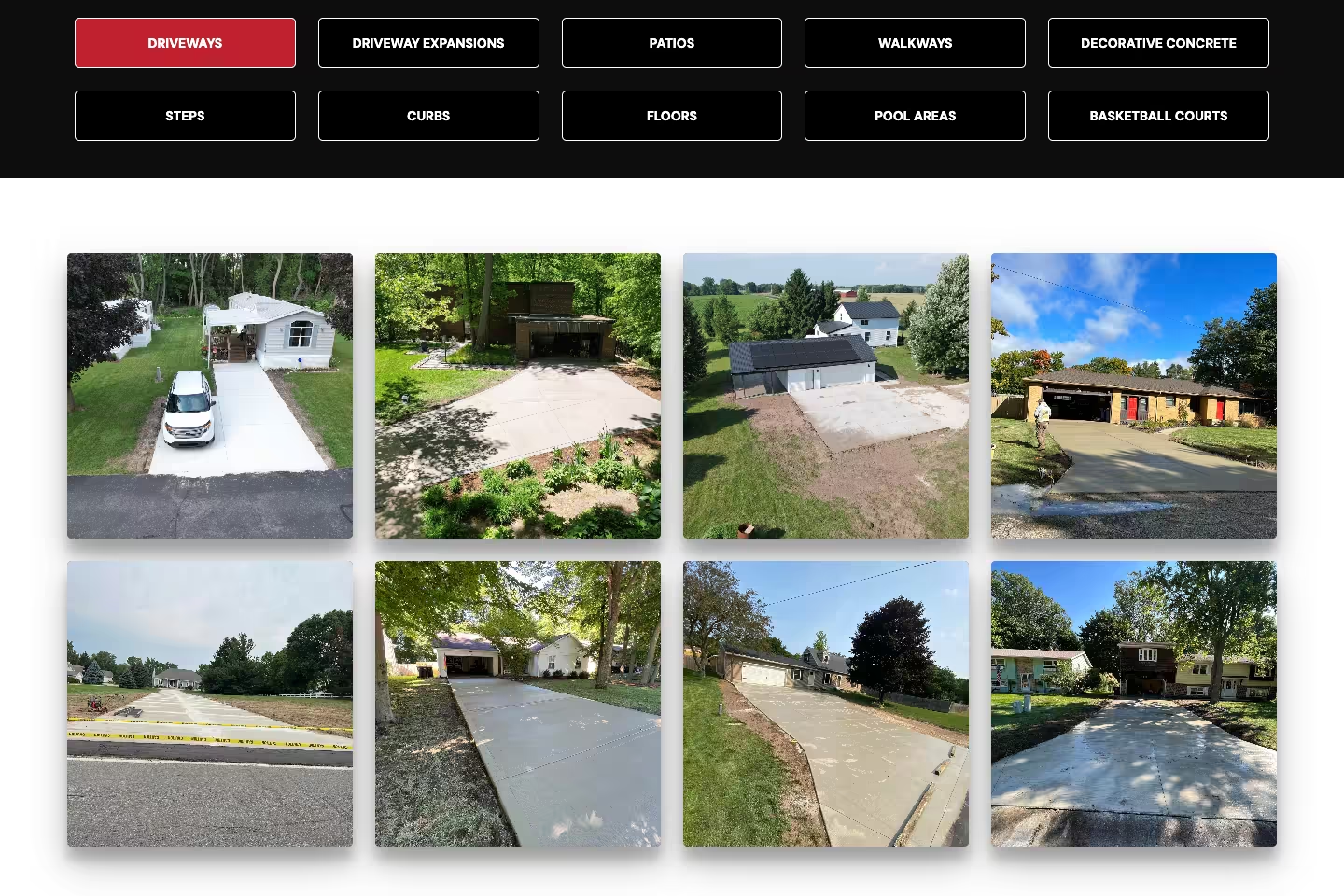
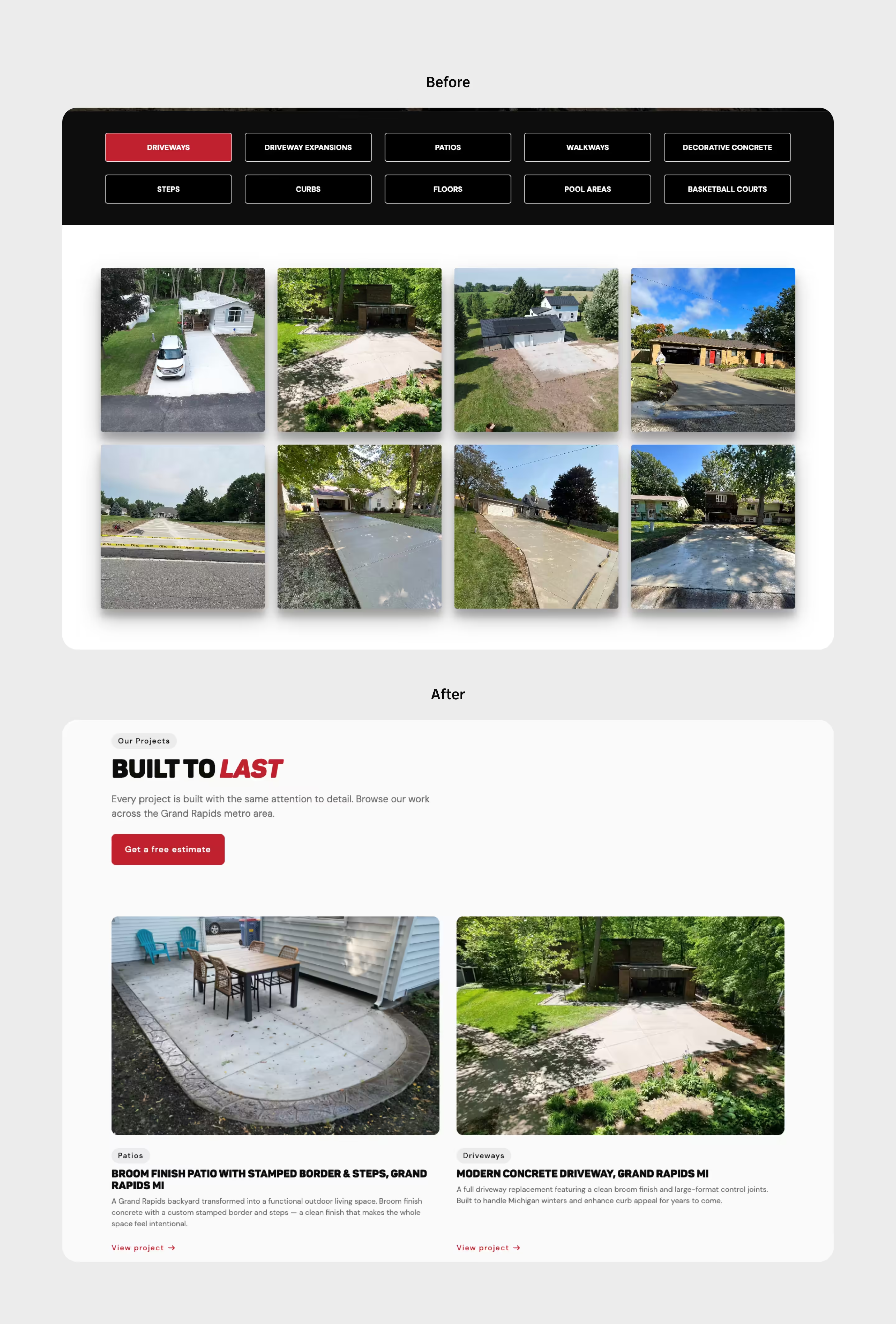
The old gallery used ten tabs with up to eight projects per tab, each opening into a lightbox stuffed with every photo the client had provided. It prioritized volume over quality and gave users no clear starting point. Because of this, the new Projects page opens with a compact hero followed by five curated project cards showing the most recent and visually varied work. Each card links to a dedicated CMS project page with a gallery of eight selected images, giving users depth without overwhelming them upfront.
Replacing the video hero with a structured image layout
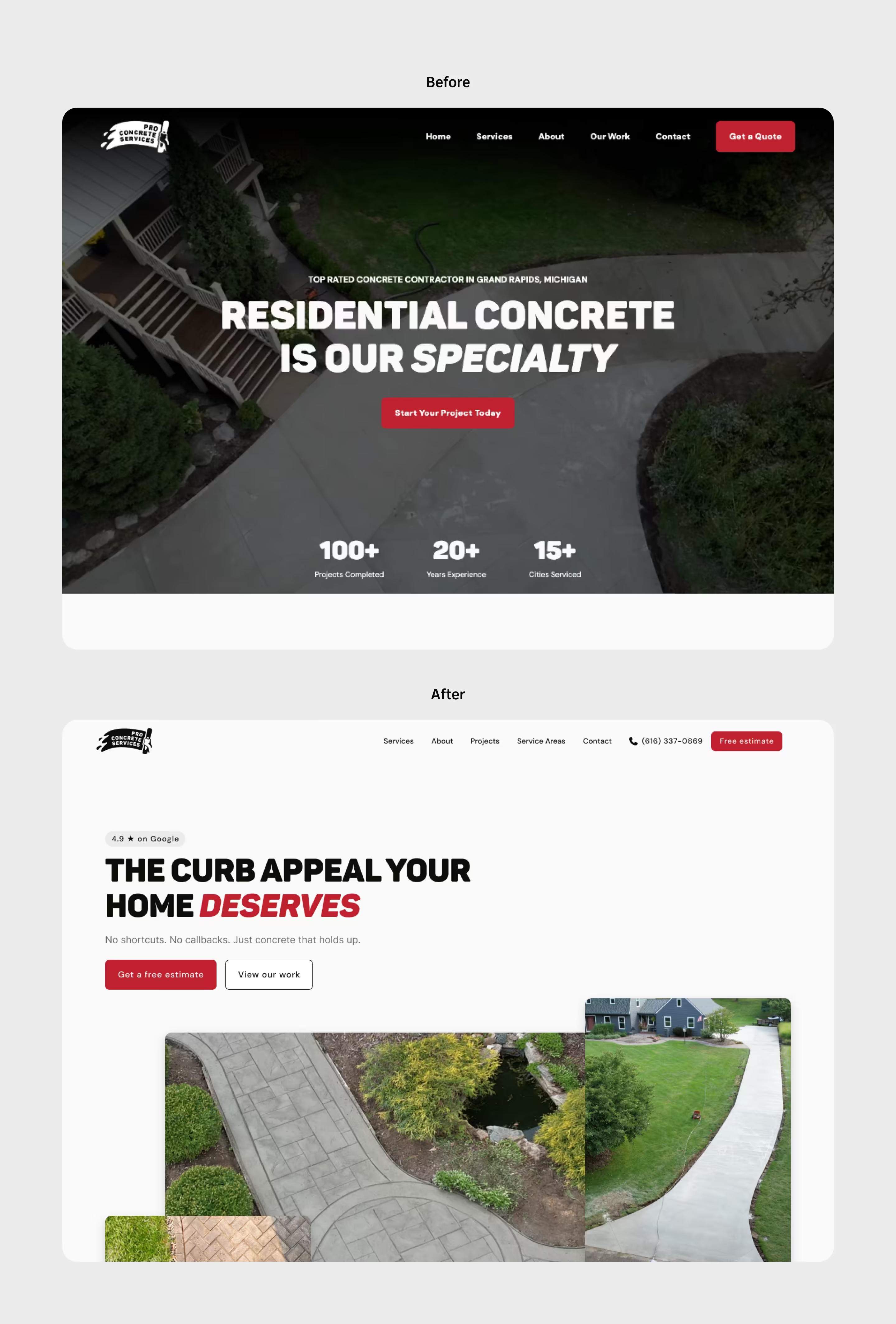
The background video created two problems: page speed dropped significantly on load and visual attention went to the video rather than the copy and CTAs. The new hero uses the brand's off-white as a solid background with a structured copy block on the left and a three image layout on the right, a main 4:3 image flanked by a square and portrait image that scroll in opposite directions on scroll. On tablet and mobile the secondary images disappear to keep the focus on the primary visual and CTAs. This led to a significantly faster load time and a hero where the copy, not the background, earns the user's attention.
Building on CMS from the start
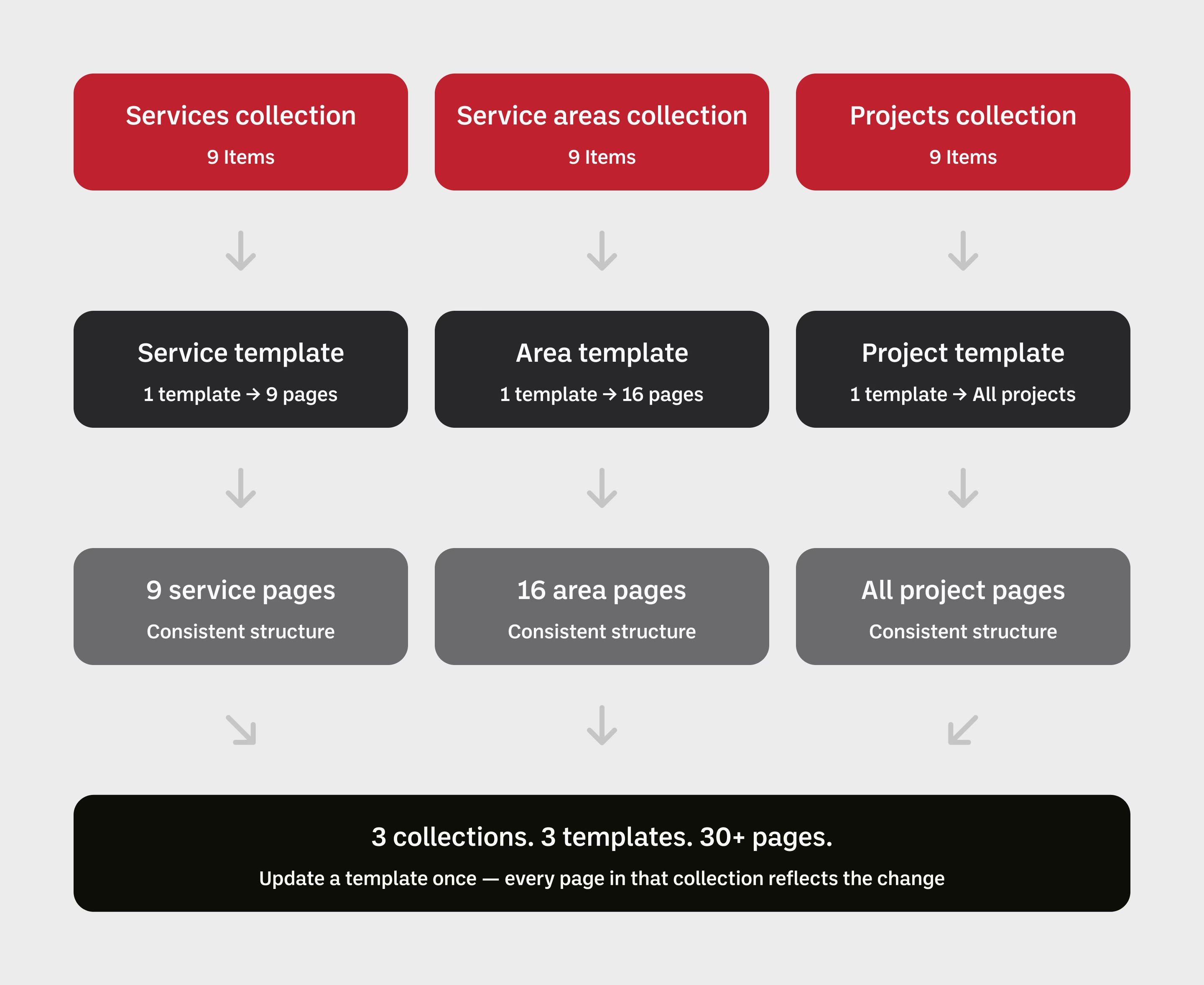
With 8 service pages and 16 service area pages, static pages were never a realistic option. Every page in those collections follows the same structure with different content, making CMS template pages the only maintainable solution. This meant the client can update project details, add service areas, and manage content without touching the underlying design. For a one-person operation, that independence was a non-negotiable deliverable.
SEO as a design decision, not an afterthought
Keyword research informed not just meta titles and descriptions but copy structure throughout the site. Strict HTML hierarchy was followed on every page. Keywords were placed in image file names and alt text, and copy was written to sound customer-facing rather than keyword-stuffed. The result is a site that ranks first in the local business pack for high-intent searches like "concrete Grand Rapids," driven by structural decisions made at the design and development stage.
When design and SEO collide
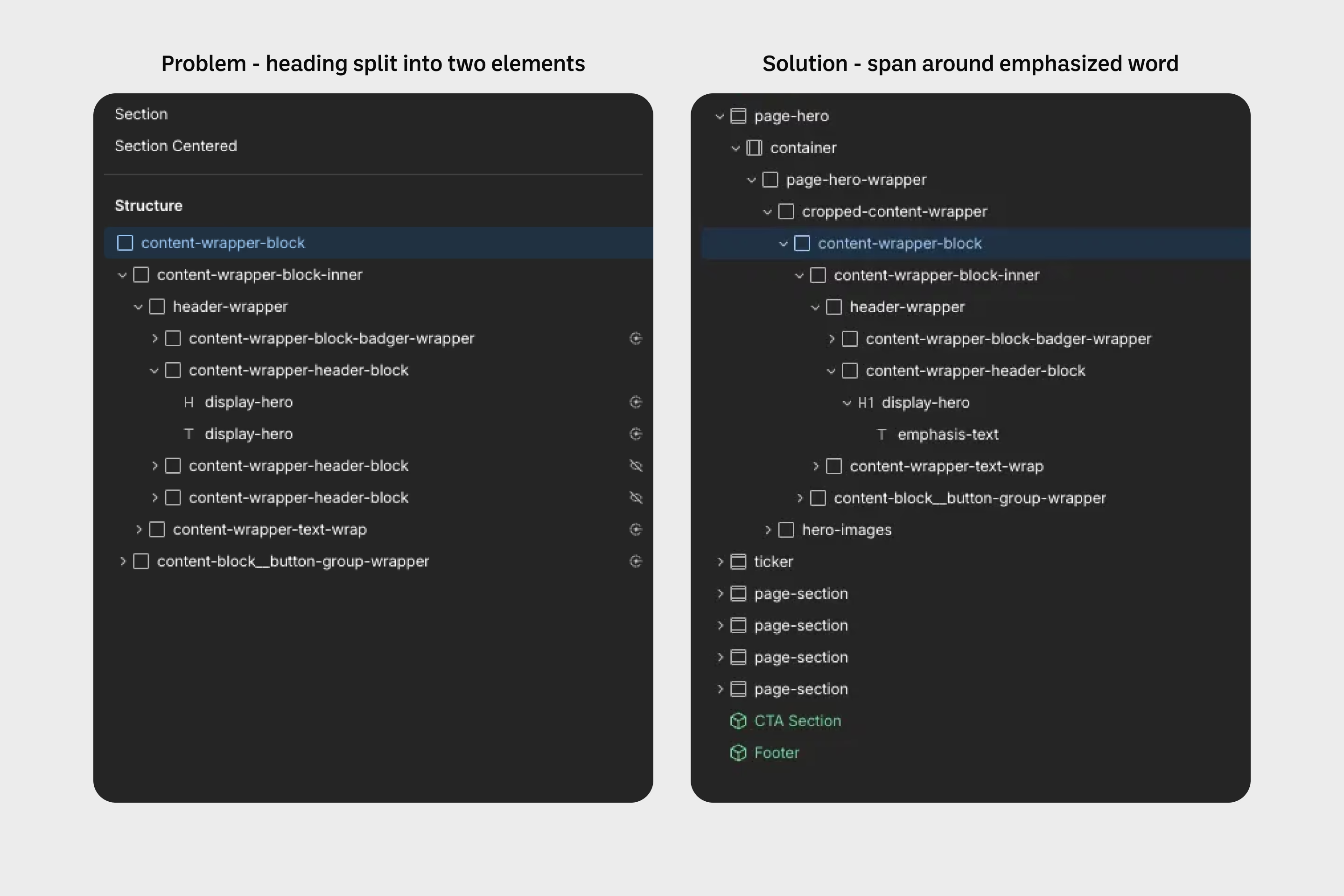
The biggest technical challenge came from a conflict between design intent and SEO requirements. Page headers used a bold display font where the last word appears italic and in red, a treatment that required two separate elements inside a reusable component to render correctly. Late in the project it became clear that two heading elements signal two separate sentences to search engines, undermining page hierarchy. For every crucial H1 the component was detached and restyled as a single element with a span, preserving the visual treatment without compromising semantic structure.
Built to convert
A conversion-focused Webflow site built on a foundation the old site never had: a design system, semantic HTML structure, CMS-powered content, and copy written around the customer rather than the company.
The homepage drives a single conversion action, the estimate form, supported by social proof, service clarity, and drone photography that lets the work speak for itself. Eight service pages and sixteen service area pages are CMS-powered, meaning consistent structure with zero manual duplication.
Every page decision, from the hero image layout to the form field reduction, was made to move a visitor one step closer to becoming a lead.
The phone doesn't stop ringing
The redesign converted a brochure site into a lead generation tool. GA data shows a consistent flow of users moving from the homepage to the contact page to the form confirmation redirect, a path the old site never established clearly. Of the users who reached the contact page, 42% submitted an estimate request, a direct result of reducing form friction and removing fields that caused users to abandon before completing. For a one-person concrete operation, a phone that rings every day and a calendar booked out weeks in advance within the first month of season represents the direct business value a well-structured conversion-focused website can deliver. Prioritizing the client's drone photography over generic stock imagery was one of the most impactful design decisions on the project. Competitors use stock. PCS shows the actual work, from above, in detail. That visual differentiation builds trust before a user ever fills out a form.