Project Overview
- Brand Designer
- Web Designer
- Webflow Developer
- Visual design system
- Multi-page website
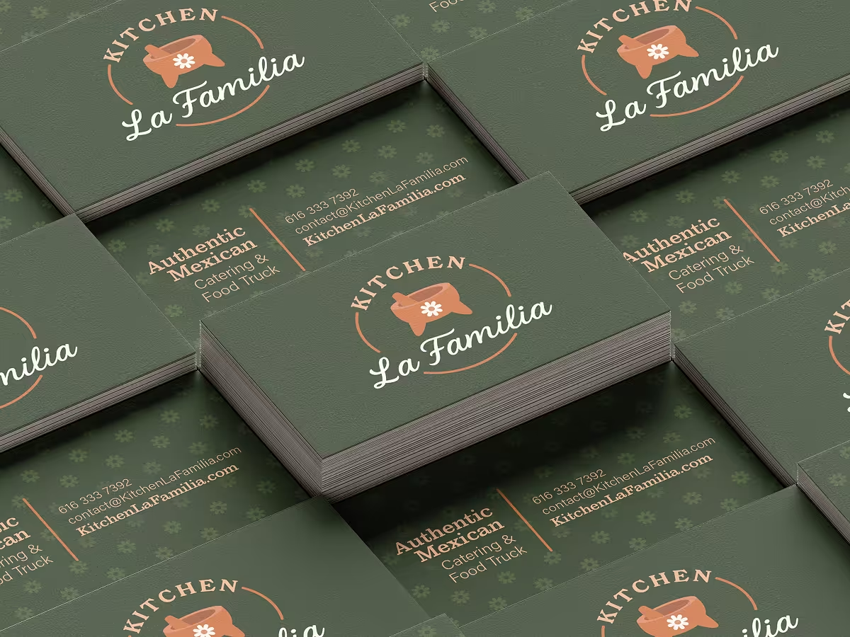
- Business cards
- Menu design
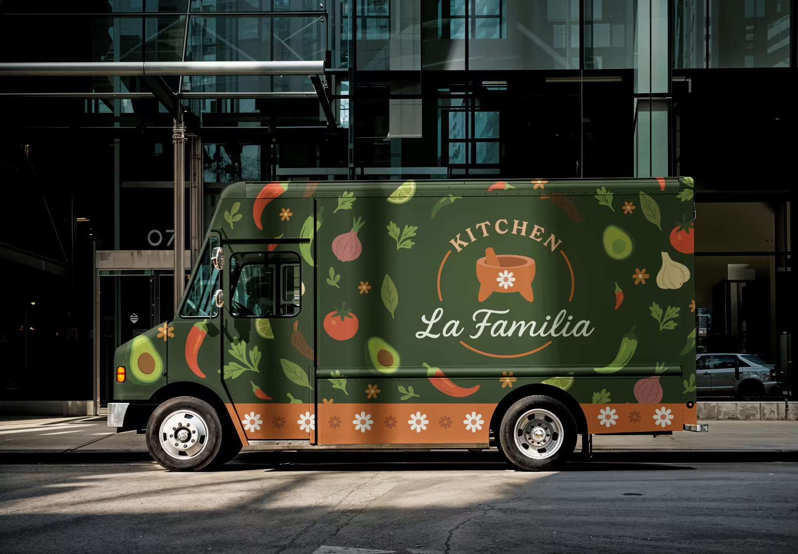
- Food truck wrap
- Figma
- Webflow
- Adobe Illustrator
- VS Code
- HTML/CSS/JS
- Claude Code
My Role
I partnered with Kitchen La Familia to establish a complete visual identity system, developing a strategic color palette rooted in the landscape of Nochistlán, Zacatecas, Mexico, where the family originates. I collaborated with a graphic designer to produce the logo, then designed business cards, food truck menu, and truck wrap. I built the multi-page website in Webflow, creating a home page, catering menu, and request form to support their expansion from food truck to brick-and-mortar restaurant.
The Opportunity
Kitchen La Familia was launching as a new Mexican food business in Grand Rapids, starting with a blank food truck and no brand presence. The family needed a complete identity system: logo, color palette, typography, website, business cards, menu, and truck wrap to establish themselves as the most professional and authentic Mexican caterer in the Grand Rapids metro area.
The challenge was creating a cohesive brand that worked seamlessly across print, digital, and physical applications while positioning them for their primary business model: catering with food truck services. With Michigan's food truck season running late spring through October, they needed the brand and website launch ready before their community event debut. The website needed to establish credibility, showcase their authentic story, and generate catering requests while supporting their seasonal food truck presence.
Key Needs:
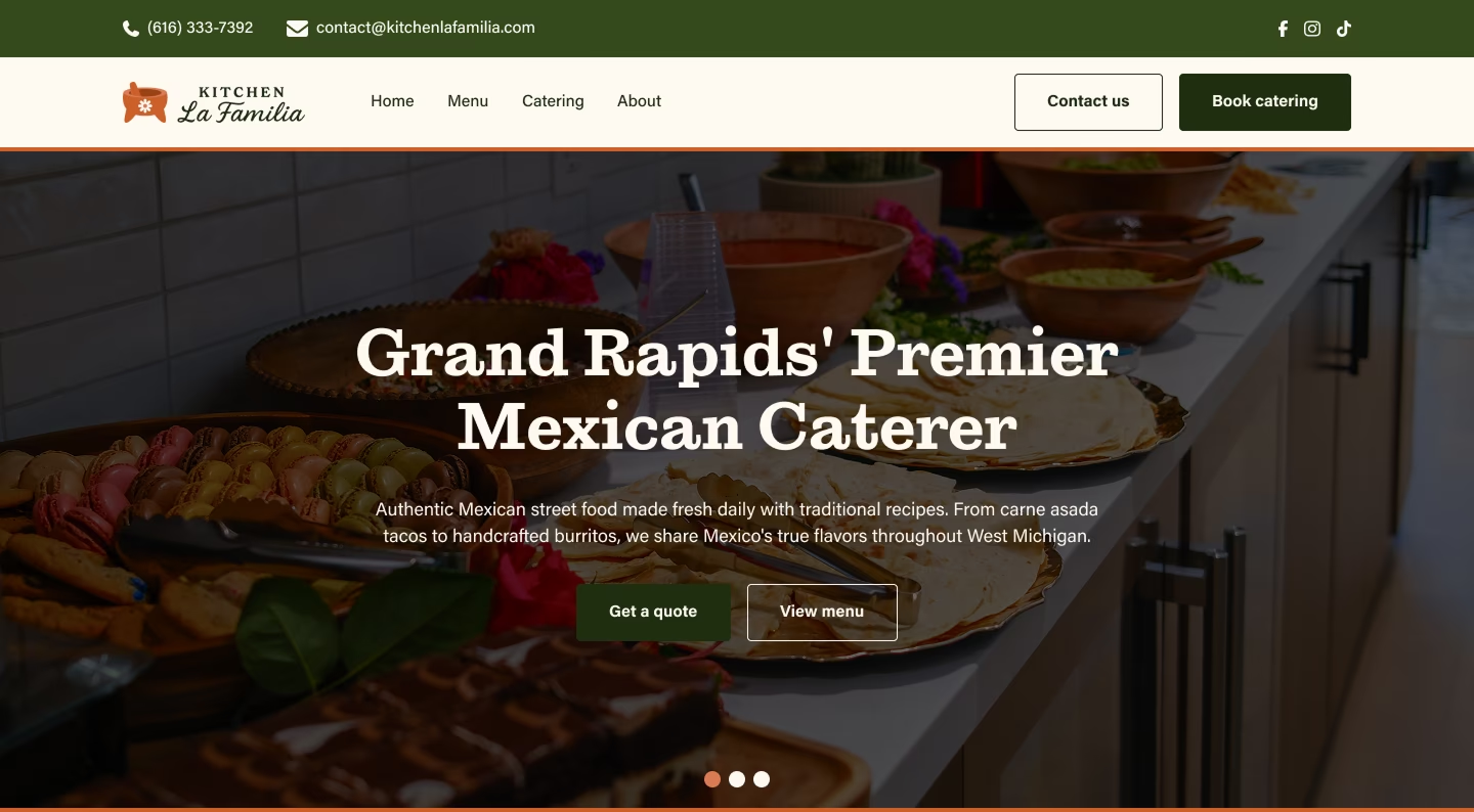
- Grand Rapids' Premier Mexican Caterer
- Compete with established Grand Rapids food trucks through cohesive branding across truck wrap, print materials, and digital platforms
- Communicate authentic family recipes and multi-generational food industry experience to position as "Grand Rapids' Premier Mexican Caterer"
- Design supporting materials (business cards, board-style menu, truck wrap) that reinforce professionalism at events and catering jobs
- Launch brand and website before their community event debut to start booking catering requests
- Create a scalable visual identity that could grow from food truck to established catering business
Research & Discovery
Since Kitchen La Familia was launching as a new business, I started with discovery to understand their goals and the competitive food truck landscape in Grand Rapids.
Stakeholder Interviews
Working with the Kitchen La Familia team, I learned their immediate need was generating catering bookings while establishing brand credibility in a competitive market. They didn't need a complex booking system or e-commerce platform, they needed a professional website that communicated their family authenticity, showcased their catering menu, and made it easy for event planners to request quotes. Their goals were to strengthen their online presence, win consistent catering gigs, and build toward purchasing an event venue to serve authentic Mexican food beyond the food truck model.
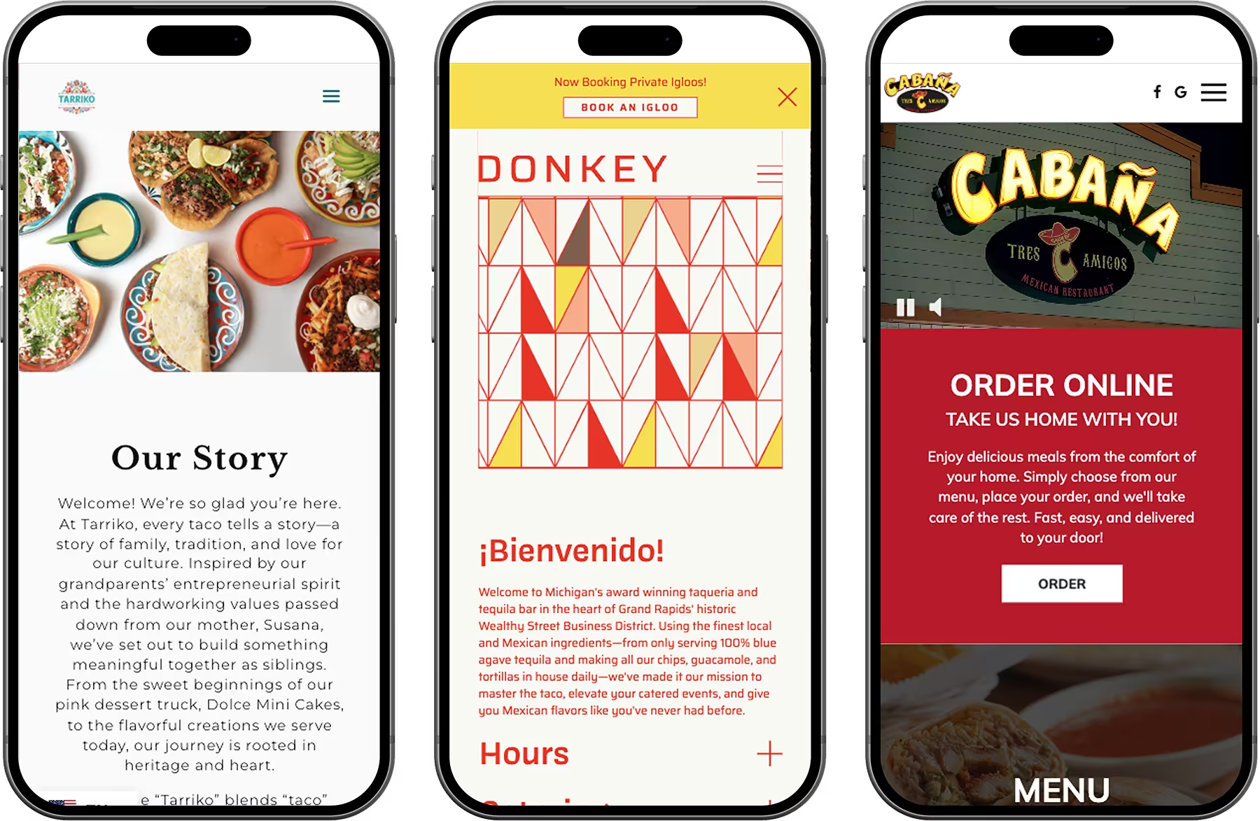
Website Competitive Analysis
I analyzed local food truck and catering businesses' web presence including Tarriko Taqueria, Donkey GR, and Cabana Tres Amigos.
- All three had engaging hero sections with strong visual elements but lacked clear calls-to-action
- Tarriko had no hero content beyond imagery, Donkey had no overlay text or buttons, and Cabana lacked directional CTAs
- Most relied on navigation alone to guide users rather than directing them to key actions
- Catering menus and request forms opened in new tabs or were missing entirely, disrupting user flow
- While Donkey had memorable branding, Cabana leaned heavily on template aesthetics with limited customization
- None clearly communicated authenticity or professionalism in the hero moment
Opportunity: A professional landing page with clear hero CTAs, integrated catering menu and request form, and trust-building elements like event highlights and testimonials to establish Kitchen La Familia as Grand Rapids' premier Mexican caterer.
Food Truck Market Context
In the Grand Rapids food truck scene, most trucks had simple designs with chalkboard or whiteboard menus and minimal branded wraps. Few invested in professional cohesive branding across their truck, signage, and print materials. I observed that well-designed, clean truck exteriors created an immediate perception of food quality and safety, while worn or basic presentations raised subconscious concerns about professionalism. This informed the decision to design a comprehensive brand system at the highest quality level, ensuring every touchpoint (truck wrap, menu boards, business cards, website) worked together to communicate Kitchen La Familia's professionalism and authenticity.
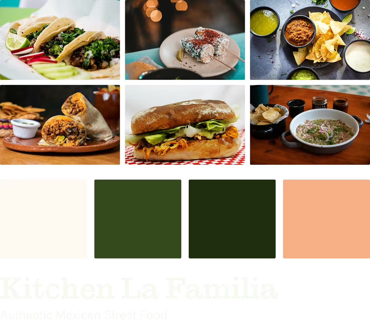
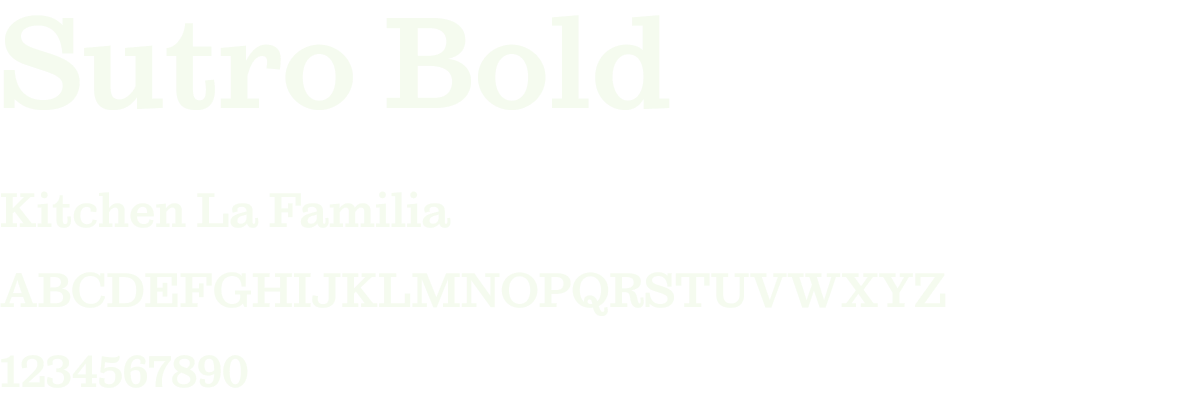
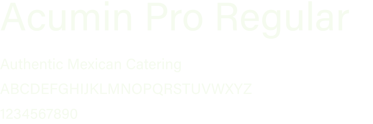
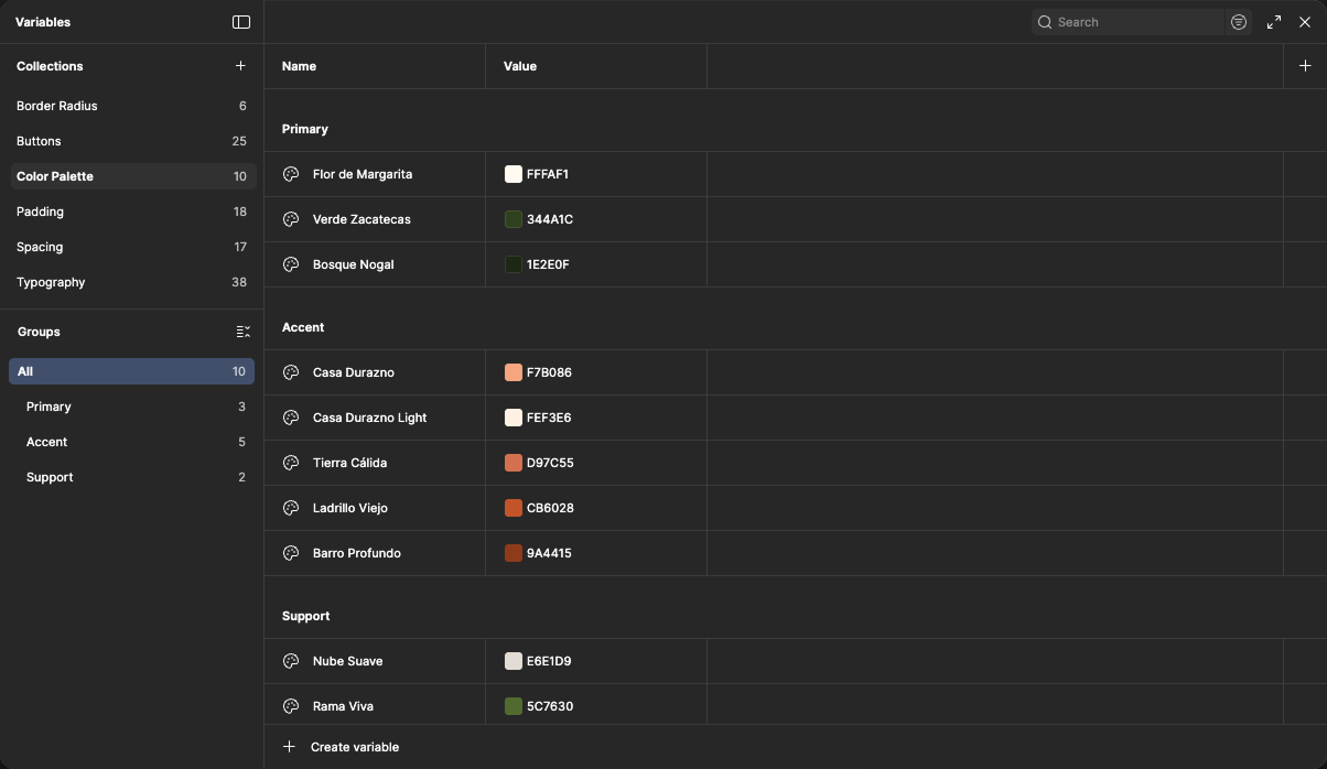
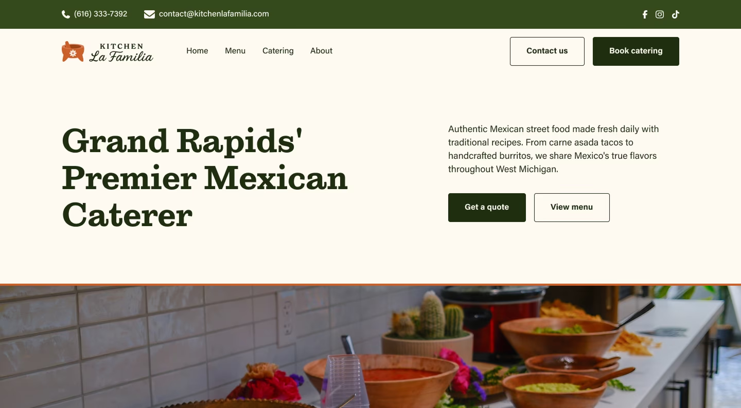
The mood board establishes visual direction through vibrant, authentic Mexican food photography. The color palette draws directly from Nochistlán, Zacatecas: Flor de Margarita (#FFFAF1), a warm soft white referencing the daisy flower in the logo and the owner's mother's name; Verde Zacatecas (#344A1C), inspired by the Mexican flag and regional greenery; Bosque Nogal (#1E2E0F), a deep green reflecting walnut forests native to the region; and Casa Durazno (#F7B086), a warm peach tone inspired by the town center's building facades. Typography pairs Sutro Bold for headlines with Acumin Pro Regular for body text, creating a bold and traditional tone that honors family heritage while feeling professional and approachable.
Key Insight
Kitchen La Familia needed a complete brand system that positioned them as Grand Rapids' premier Mexican caterer from day one, not a basic food truck with minimal branding. The website had to prioritize catering lead generation with an integrated request form, unlike competitors who used external links or had no form at all. Every touchpoint (truck wrap, menu boards, business cards, website) needed to work together to communicate professionalism and family authenticity, building trust with event planners and customers in a market where most food trucks had inconsistent or minimal branding.
Visual Identity
Color Palette: Rooted in Heritage
Rather than choosing colors arbitrarily, I tied the palette directly to Nochistlán, Zacatecas, where the family originates and their recipes come from. Each color references a specific element of the town's landscape and culture, creating an immediate connection between the brand and its authentic Mexican heritage.

Flor de Margarita
#FFFAF1
Verde Zacatecas
#344A1C
Bosque Nogal
#1E2E0F

Casa Durazno
#F7B086
Ladrillo Viejo
#CB6028
Typography System
I paired Sutro Bold for headlines with Acumin Pro Regular for body text, buttons, and links. Sutro's bold, authentic character brings personality and confidence to large display moments like the website hero and menu titles, while Acumin Pro's clean sans-serif geometry ensures readability across body copy, UI elements, and smaller text on business cards and signage. Together they create a professional yet bold aesthetic that feels authentic to Kitchen La Familia's heritage while maintaining clarity across digital and print applications.
Website Design
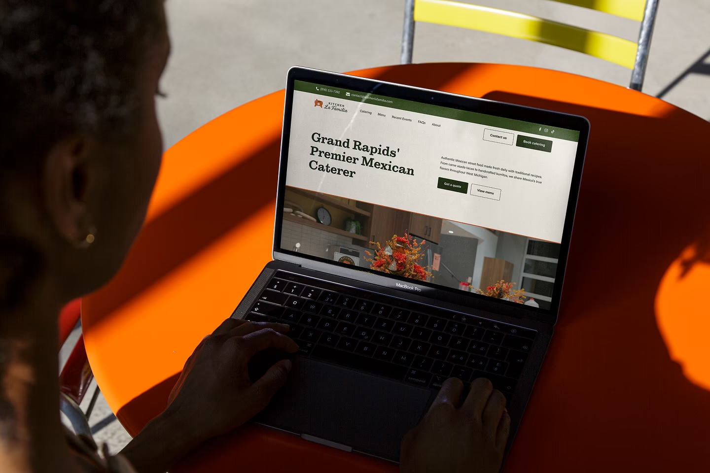
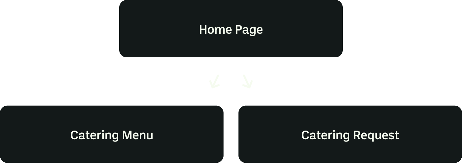
Site Architecture & User Flow
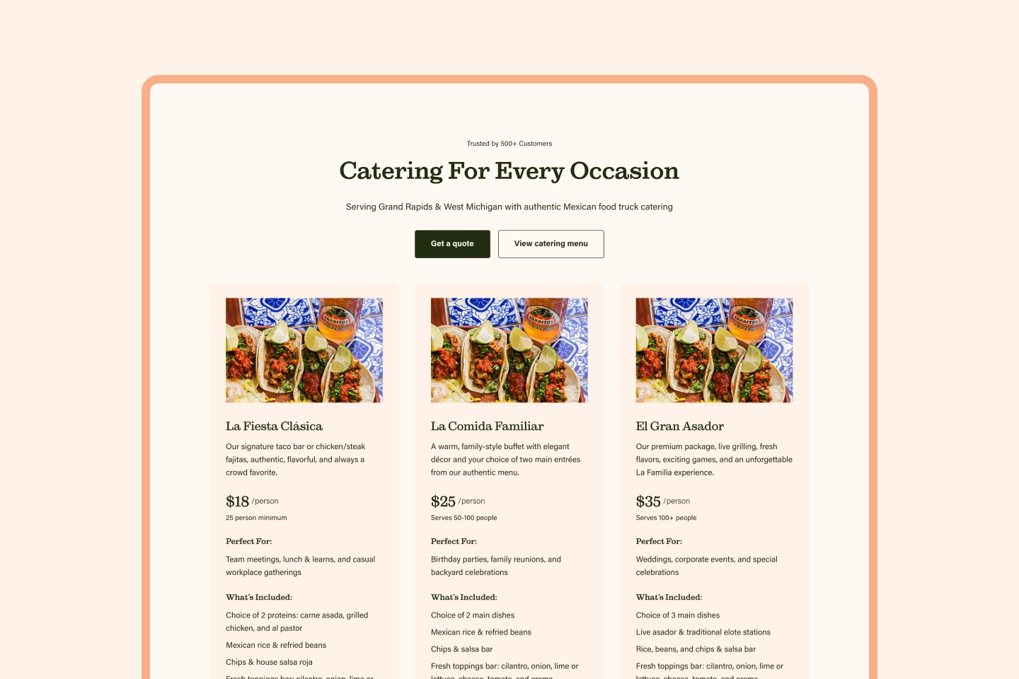
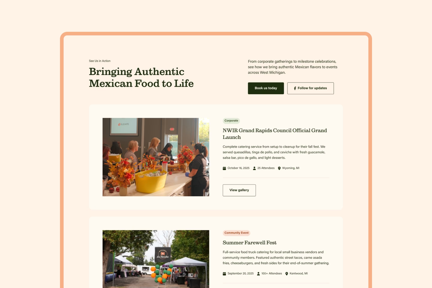
Kitchen La Familia needed a multi-page structure to prioritize catering lead generation without overwhelming the homepage. I created three pages: Home, Catering Menu, and Catering Request. The homepage serves as the primary entry point with hero CTAs directing users to either browse the detailed catering menu or submit a request directly. For users who stay on the homepage, the flow guides them through catering packages, food truck menu options, recent events, testimonials, FAQs, and a contact form.
This multi-page approach made sense because the detailed catering menu and request form each needed dedicated space. Placing a comprehensive catering form on the homepage would have created poor UX and distracted from the primary goal of converting visitors into leads. By separating these into focused pages, users can explore catering options in depth or jump straight to booking without friction.
Design System
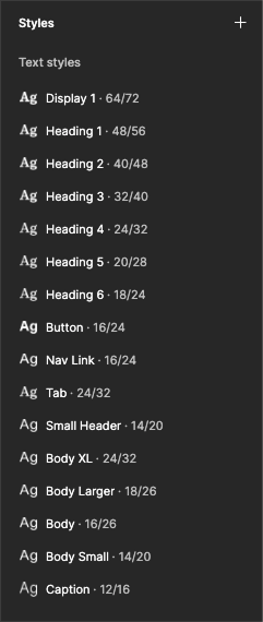
I built a comprehensive design system in Figma with 20+ text styles, reusable components, and color variables. This ensured consistency across all three pages and made the design scalable as Kitchen La Familia's business grows. The type scale ranges from large display text to small captions, with responsive sizing for desktop, tablet, and mobile.
Using Figma's component variants and auto-layout, I created a library of reusable elements, including buttons, form fields, and catering package cards, that maintain brand consistency while allowing flexibility for future menu updates and page additions. This systematic approach also streamlined development, as every element had clear specifications for Webflow implementation.
Landing Page Design & Key Decisions
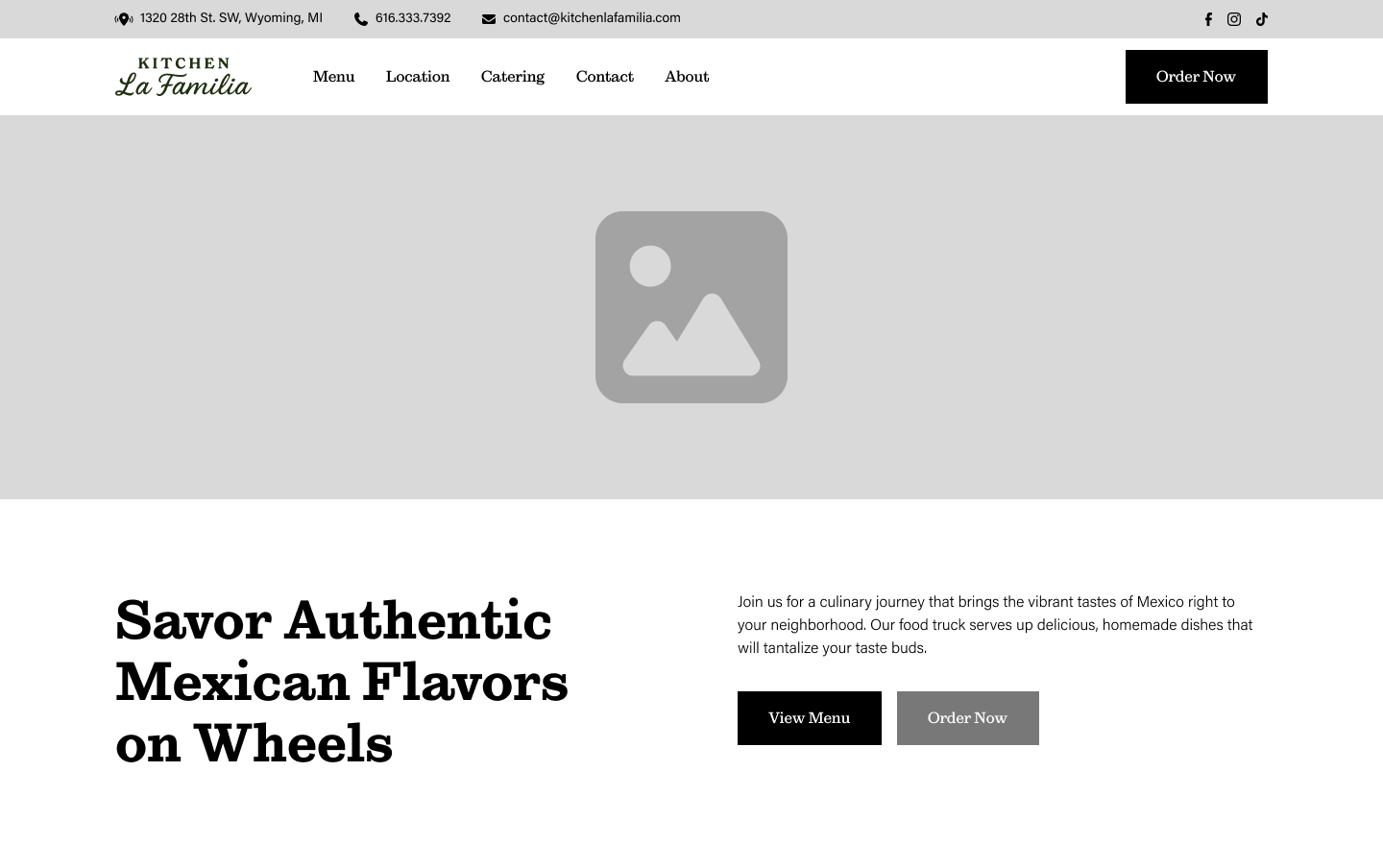
Early wireframes establishing content hierarchy. Nav + Hero (left), Food Truck Menu (center), Catering Packages (right)
Hero Design & Testing
I explored two hero approaches: a hero image slider with different messaging on each of five slides, versus a static hero with header, body text, and clear CTAs above an image slider positioned below the fold.
Testing revealed users strongly preferred the static hero. They could focus on one clear message and action path rather than deciding which slide to navigate to. This aligns with established UX principles: Nielsen Norman Group research shows users often ignore carousels due to banner blindness, leading to low click-through rates. The automatic rotation proved distracting and took control away from users. Additionally, overlay text on mobile created readability challenges.
The static hero with CTAs above the fold followed progressive disclosure principles, giving users clear direction immediately while allowing them to explore food imagery below at their own pace. This reduced cognitive load and maintained mobile usability without sacrificing visual impact.
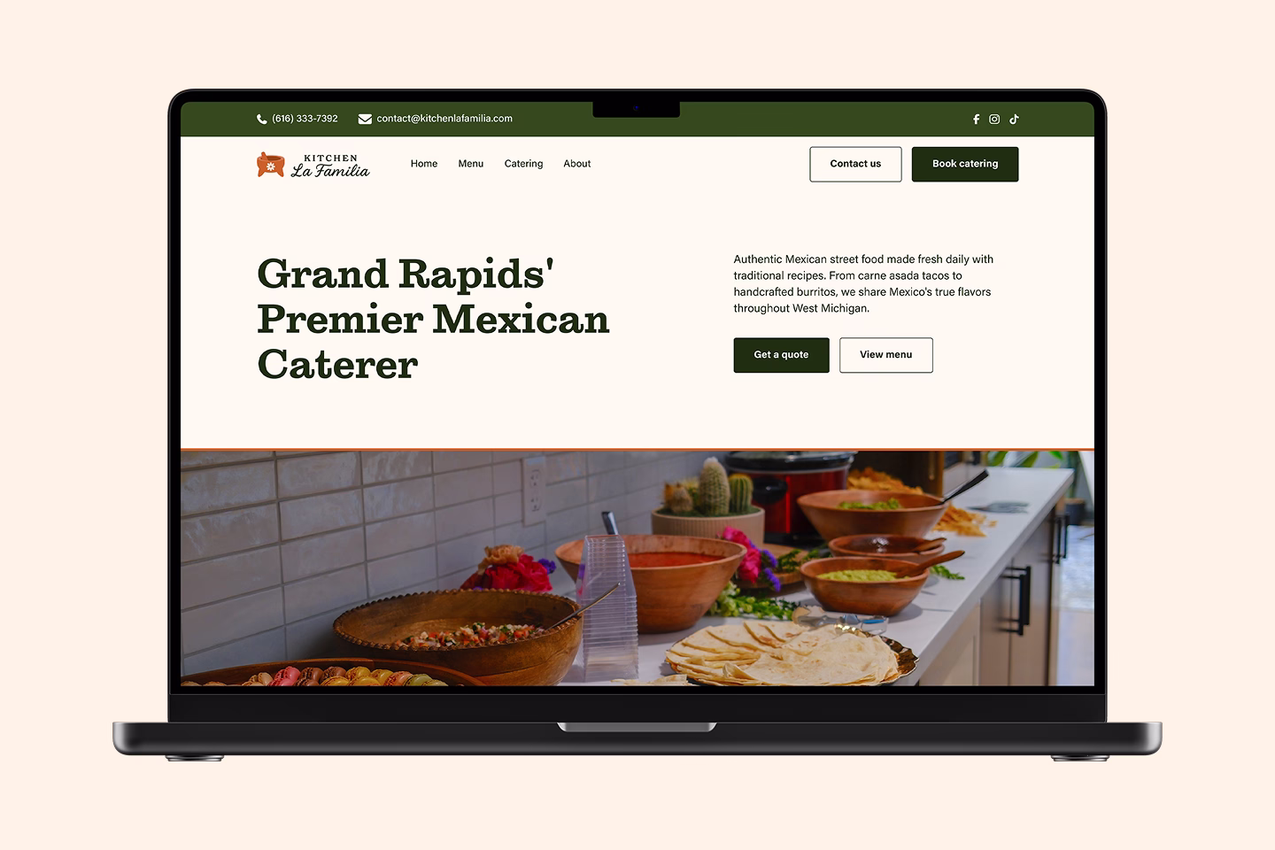
Responsive Design
I designed for desktop first to establish the full visual system, then optimized for tablet and mobile throughout both design and development. Since most event planners and customers discover Kitchen La Familia on their phones through social media and event searches, mobile experience was a priority. Every breakpoint was carefully considered to ensure generous touch targets, readable text, and intuitive navigation across the homepage and catering request form.
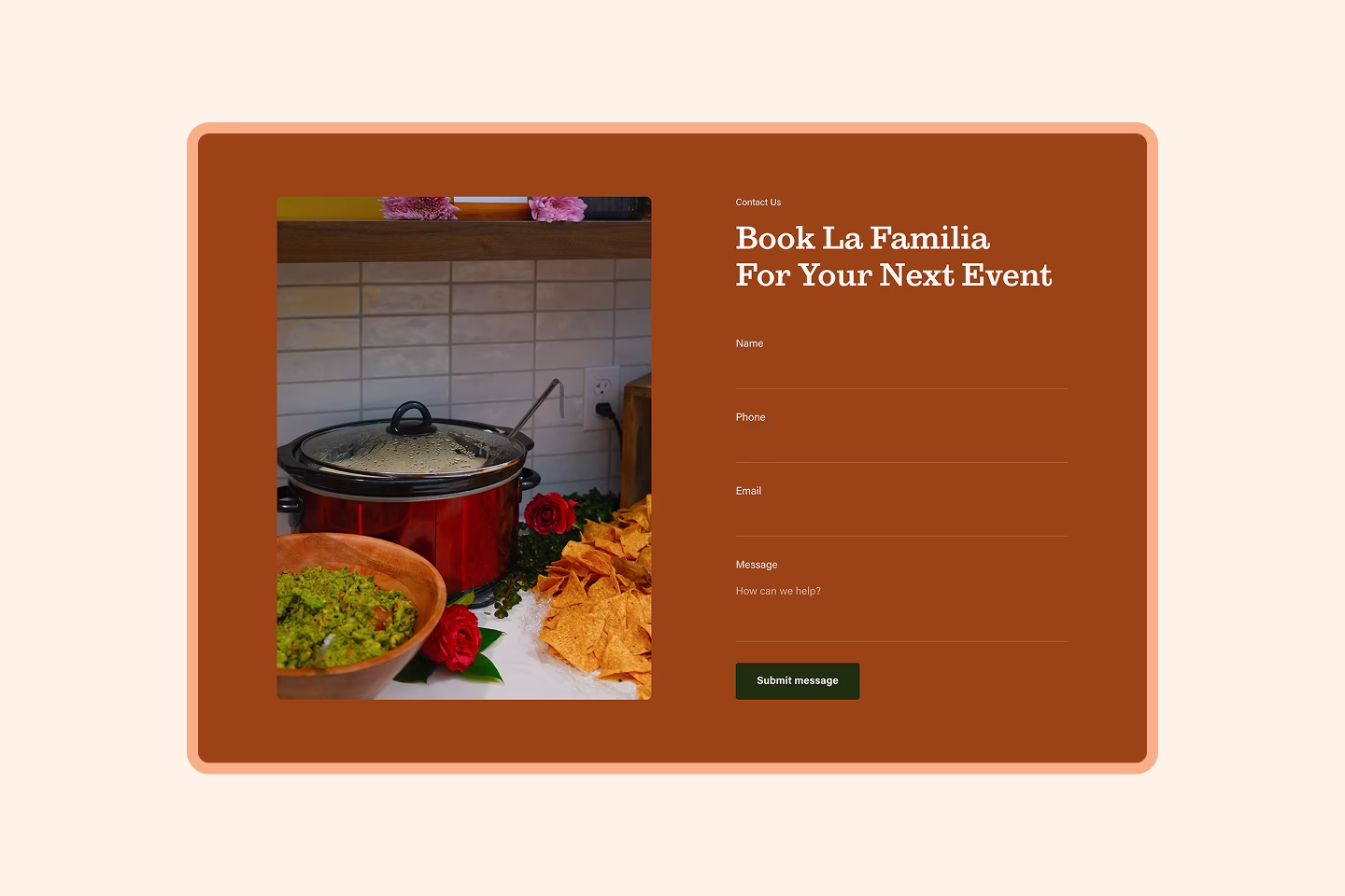
Catering Request Page
Unlike competitors who redirect to Google Forms or rely on phone calls for quotes, I built the catering request form as a dedicated page within the site. This keeps users in the branded experience while collecting detailed information that allows Kitchen La Familia to provide faster, more accurate estimates.
The form includes five sections: Contact & Event Basics, Service Details, Location, and Additional Details (with optional fields). While longer forms risk higher bounce rates, at least half of the 15 fields are quick inputs like contact information and location, reducing friction. The comprehensive information gathered upfront minimizes back-and-forth communication, streamlining the booking process for both the client and Kitchen La Familia staff. The form is fully optimized for mobile with clear labels, appropriate input types, and generous touch targets.

Content Strategy
The copy emphasizes family authenticity and catering professionalism over extensive storytelling. Kitchen La Familia's heritage and expertise in authentic Mexican cuisine is established clearly in the hero and about section, then the site lets food photography, catering packages, recent event highlights, and customer testimonials build confidence and drive catering requests.
Development
I built the site in Webflow with CMS collections for catering packages, menus, recent events, and testimonials, giving Kitchen La Familia full content control. Custom JavaScript (developed with Claude AI assistance) handles image sliders, menu navigation tabs, and interactive accordions. The design system translates seamlessly from Figma specifications, with technical highlights including a page progress indicator and animated flower pattern strips that reinforce brand identity throughout the scroll experience.
Early testing with Kitchen La Familia's network revealed strong positive response:
- Users loved the brand and color palette rooted in Nochistlán heritage
- High-quality slider images showing full catering layouts helped visualize service quality
- Navigation between pages felt intuitive and seamless
- Homepage content gave Kitchen La Familia a professional and authentic feel
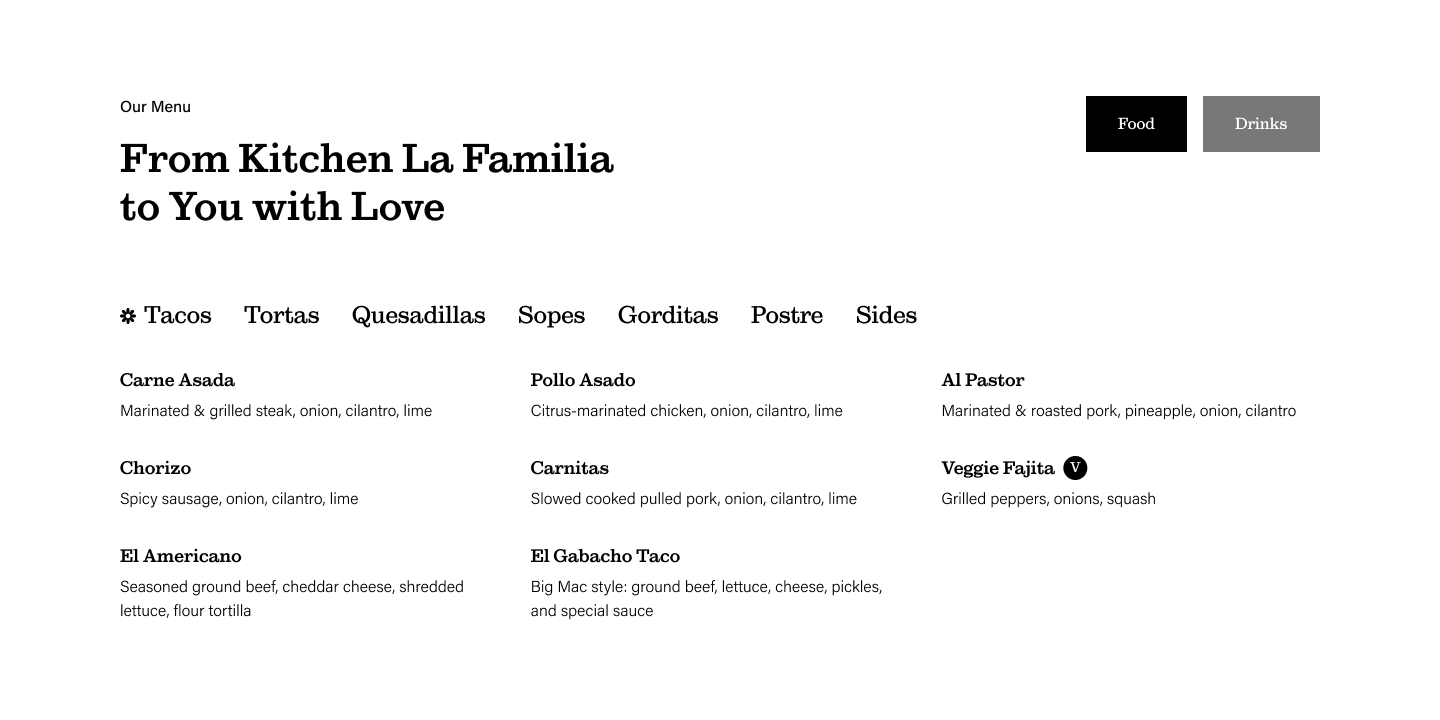
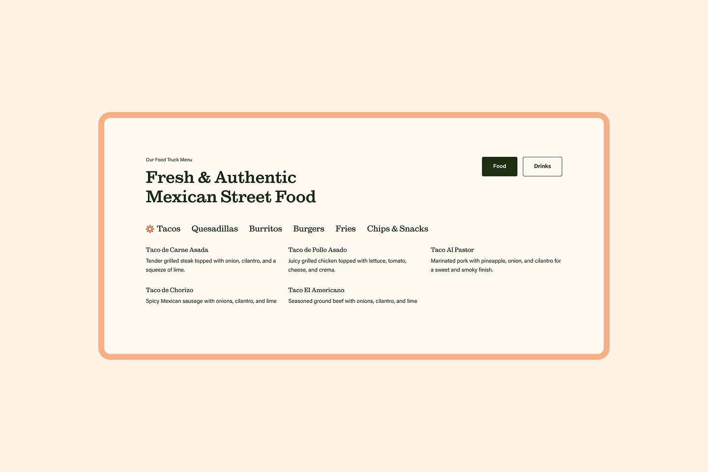
- Menu page tab switching between groups made browsing individual items easy
- Mobile menu didn't close when navigation links were tapped
- Form fields used placeholders instead of labels, reducing clarity and accessibility
- Events section felt cluttered with multiple location types and empty content states
- Hero slider needed more full catering layout images to reinforce service quality
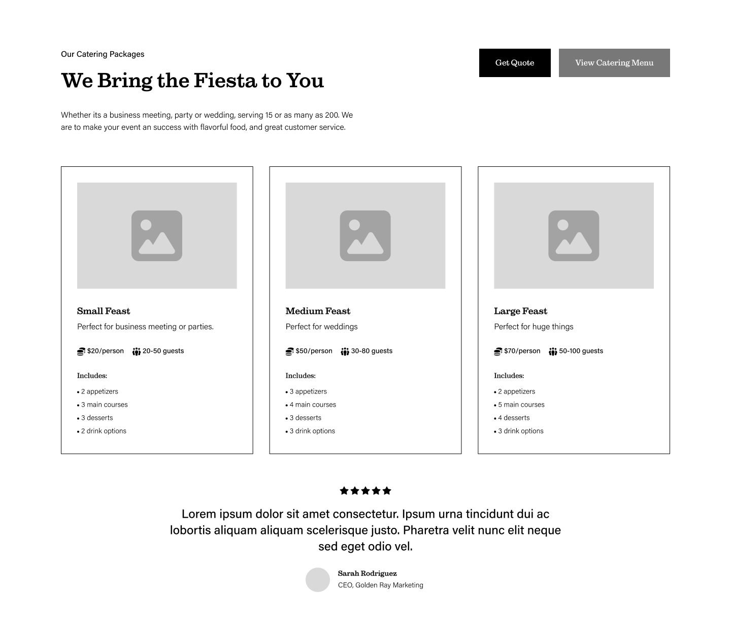
- Catering package cards lacked detail on what's included and pricing visibility
I fixed the mobile menu tap behavior and added field labels above inputs for better accessibility and usability. The events section was remade to show recent events only, and catering package cards were redesigned with larger pricing, clearer inclusions, and better visual hierarchy. Hero slider images were updated to prioritize full catering setups. Future refinements include consolidating the food truck menu with the catering menu page to maintain focus on the primary catering business model.
Final Designs
Launch & Impact
Soft launch in December, early traction shows promise despite limited marketing push.
300+
100+
50%
75
Key Learnings
This project reinforced the importance of managing all aspects of a website project beyond design and development. Working with a stakeholder group of four, each balancing full-time jobs and side businesses, made efficient discovery and review calls critical. I spent more time researching the catering market upfront to ensure the brand positioning and product solution aligned strategically before entering Figma.
I learned that client communication challenges are inevitable. The team needed branded materials for uniforms before final deliverables were ready, so they used a non-optimized version for printing, highlighting the importance of flexible handoff timelines. This project also accelerated my integration of AI tools into the design process, using Claude not just for information checking but for ideation, code generation, and copy refinement.
The "ship at 80% and optimize live" philosophy proved valuable here. The site launched with core functionality, allowing Kitchen La Familia to start booking catering while identifying refinement opportunities through real user behavior.
Future Plans
Future optimization includes restructuring the site architecture by moving content from the homepage to dedicated About and Contact pages, creating a leaner homepage with a more direct funnel to catering bookings. Additional plans include launching a marketing campaign to drive traffic, implementing SEO optimization for local catering searches, and exploring features like package customization or online payment integration as the business scales.