A website for a business that outgrew its DMs
Ashley's Antojitos had no website. Orders came through Instagram DMs — a process that required back-and-forth conversation for every single transaction and gave potential customers no way to browse the menu, read reviews, or place an order on their own terms.
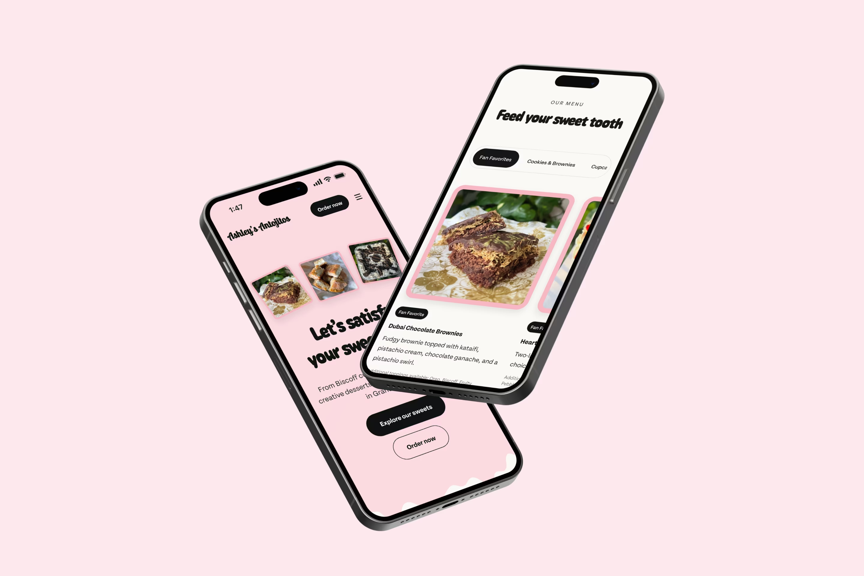
The project was a single-page Webflow site built to convert visitors without friction. A curated 10-item menu replaced what would have been 40-plus options across six categories — a decision made to reduce decision paralysis and keep the path to the order form short. The order form itself was built to support multiple items in a single submission. Testimonials and FAQ content were added as trust signals rather than filler. A CMS-powered event bar surfaces upcoming pop-ups automatically and hides itself when no events are scheduled.
A soft launch in February 2026 preceded the full release, allowing user testing that surfaced both a critical scroll bug and a hero layout preference that changed the final design. Since launch, the site has driven 50 orders and 5 catering inquiries — including a 175-guest wedding booking. Visitors are spending an average of three minutes on the page, long enough to browse the menu, read reviews, and place an order without ever sending an Instagram DM.
Built for word of mouth, limited by it
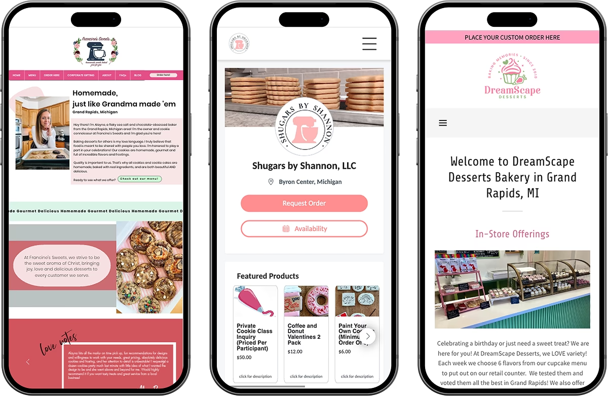
Small dessert businesses in Grand Rapids rarely have websites. The more common playbook is a Facebook page, an Instagram account, and a Google Form buried in a link-in-bio. Even at local pop-up markets, competing vendors were operating the same way — taking orders through DMs, posting availability in Facebook groups, and relying on repeat customers to keep the business moving.
Ashley's Antojitos was in the same position. A growing Instagram following had built demand for her cookies, brownies, and custom items, but every order required a conversation. There was no way for a new customer to browse what was available, understand pricing, or place an order without reaching out first. The personal connection that made the business feel approachable was also the bottleneck.
The site had one job: let a visitor see something they wanted and order it without sending a single message. That meant a menu that showed enough to be useful without overwhelming, an order form that handled multiple items in a single submission, and enough trust signals — reviews, an about section, FAQs — that a first-time customer felt confident placing an order from someone they'd never met.

Designed from the desserts out
A palette pulled from the menu
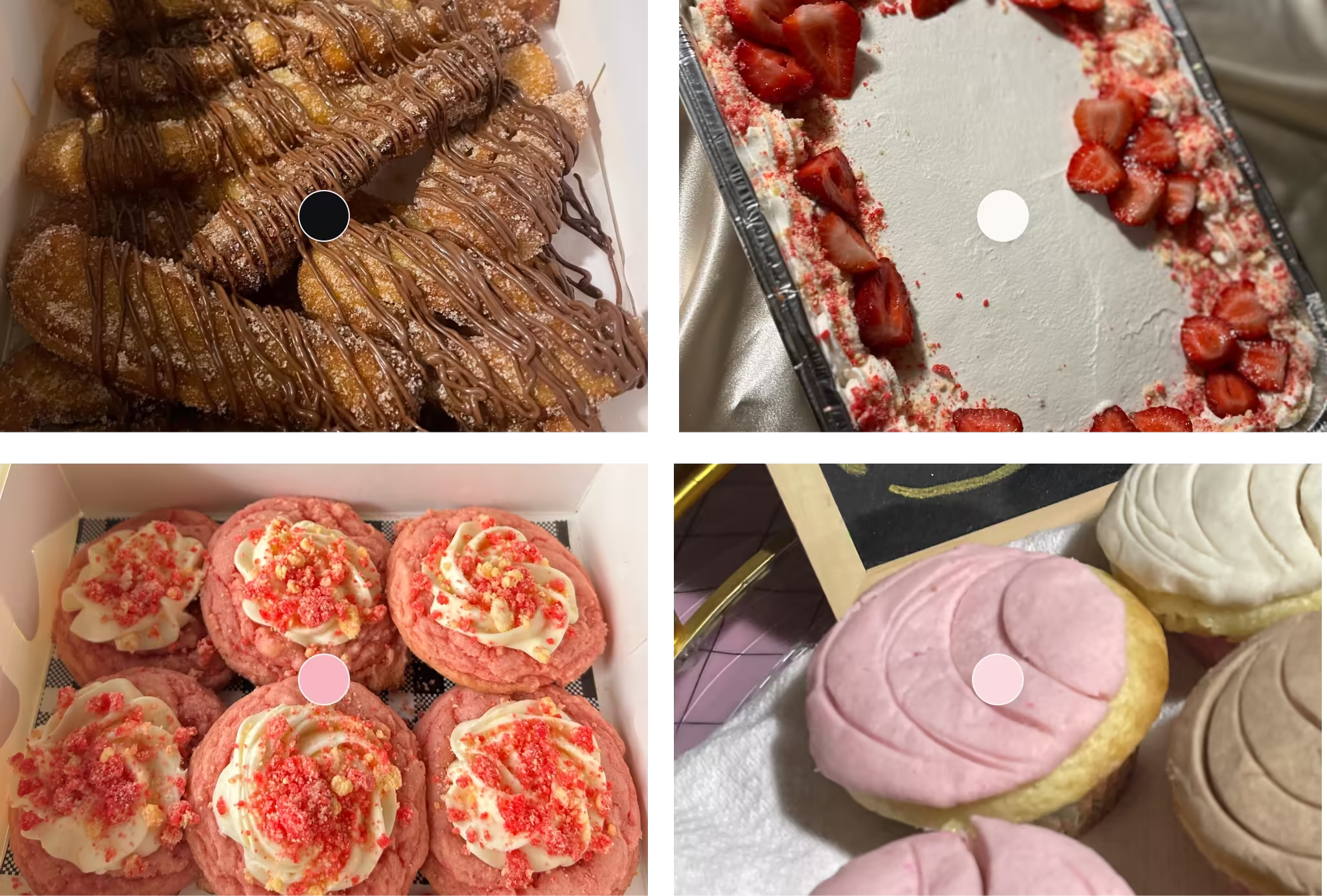
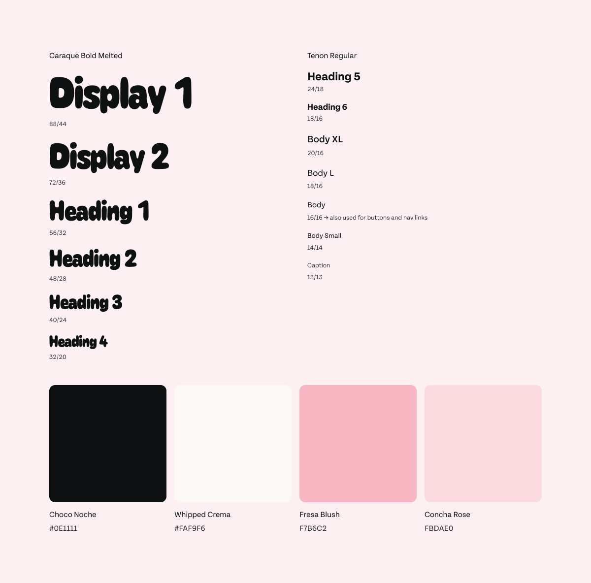
Ashley had an instinct for her brand — shades of pink, a playful feel — but no system behind it. Rather than starting from scratch or defaulting to generic dessert brand conventions, the color palette was built directly from her four most popular items: churros, tres leches cake, strawberry shortcake cookies, and pink-frosted cupcakes and conchas. Each item contributed a specific tone, narrowed down to two pink values plus a near-black "Choco Noche" and an off-white "Whipped Cream" to round out the palette.
Typography followed the same logic. Caraque Bold Melted — a display font with a subtle frosting drip quality — handled headers and brand moments. Tenon Regular, a clean sans-serif, handled body text and kept the design readable without competing with the display font. The pairing gave the site personality without sacrificing legibility.
Sequencing the page for conversion
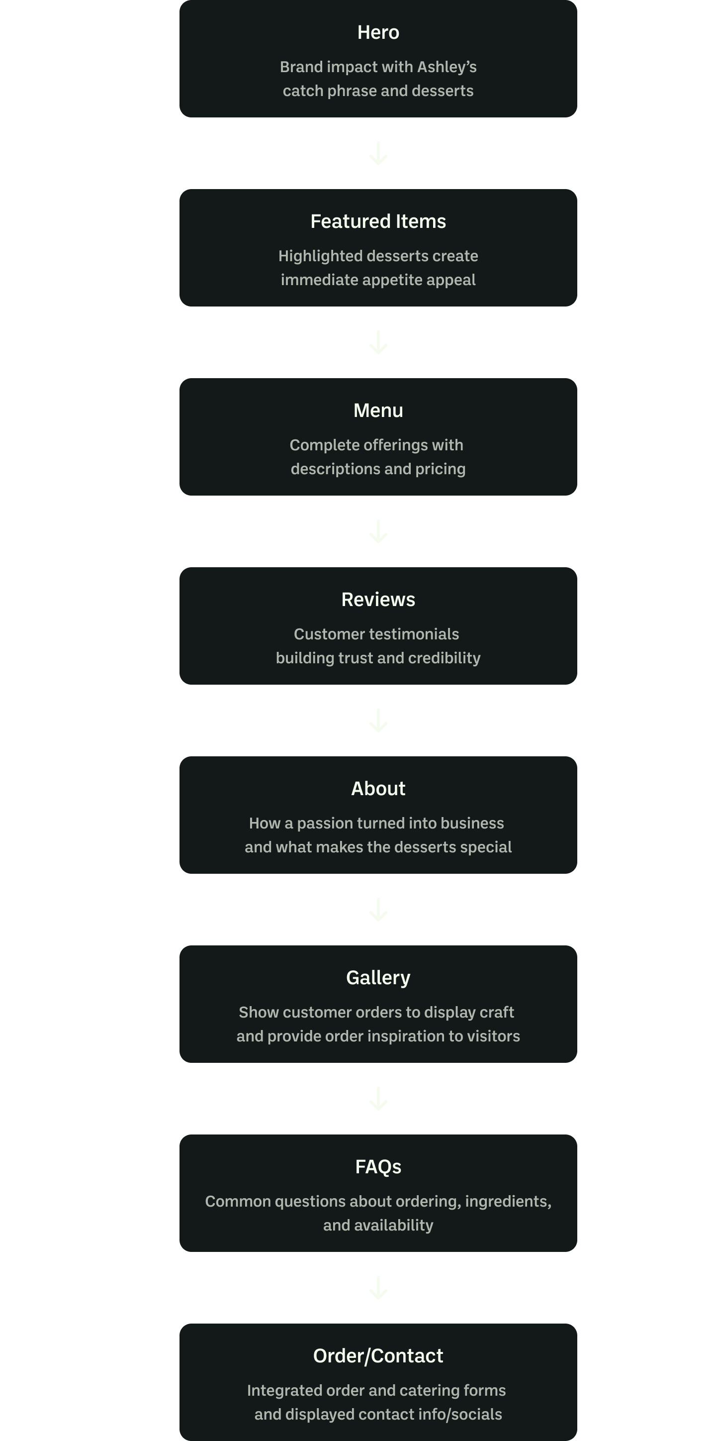
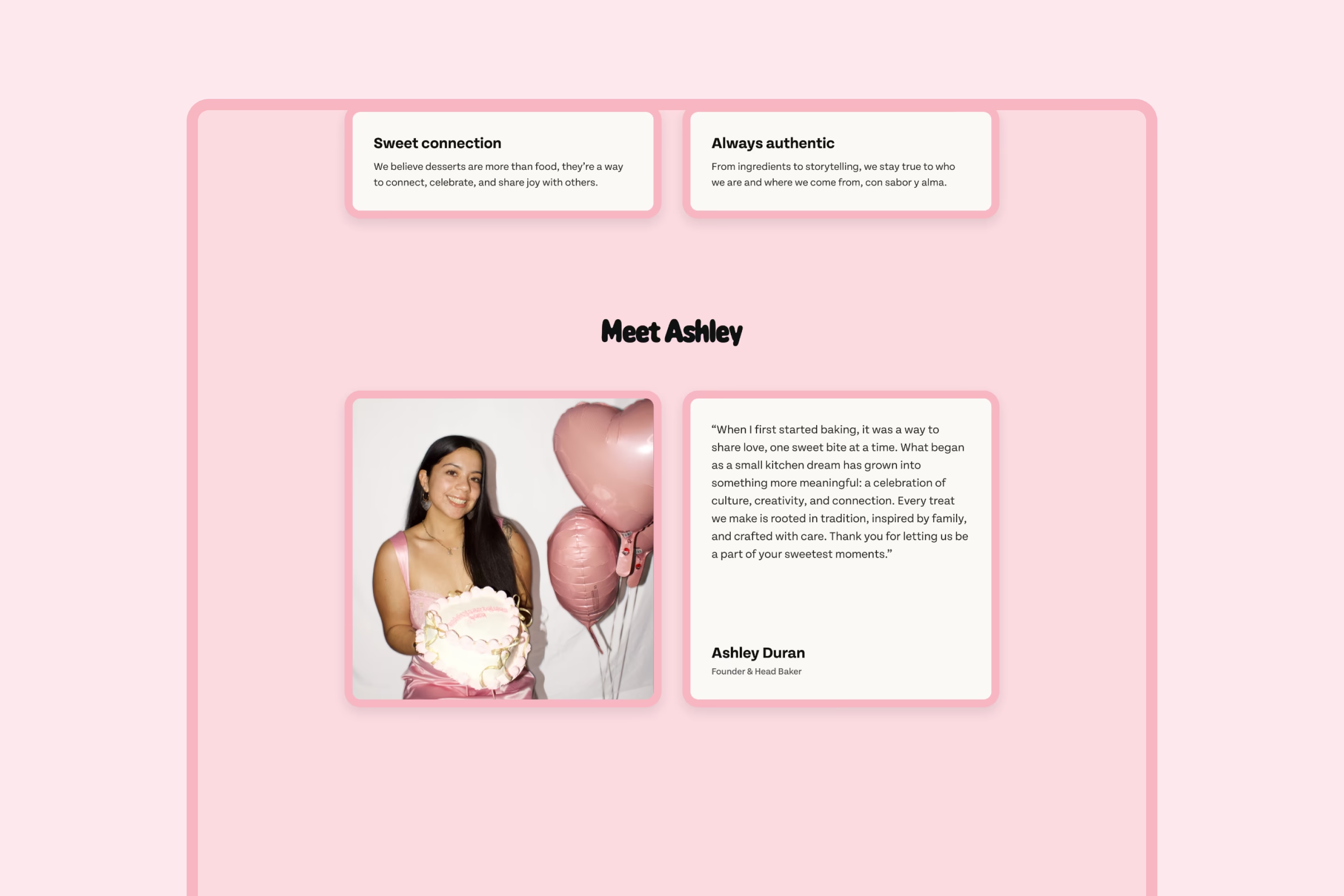
The page order wasn't arbitrary. After the hero established what Ashley makes and who it's for, Featured Items and the Menu came immediately — visitors who were hooked by the headline needed to see the product before anything else. Reviews followed directly after the menu, reinforcing the quality of what they'd just browsed with real customer feedback. About came next, adding the personal story behind the business once the product had already made the case. Gallery and FAQs handled remaining objections before the order form closed the page.
Every CTA throughout the page connects directly to the order form, so visitors never have to manually scroll to place an order. The sequence was informed by landing page research and competitive analysis — an earlier version placed About second, but moving Featured Items into that slot kept the focus on the product at the moment visitors were most engaged.
Testing the first impression
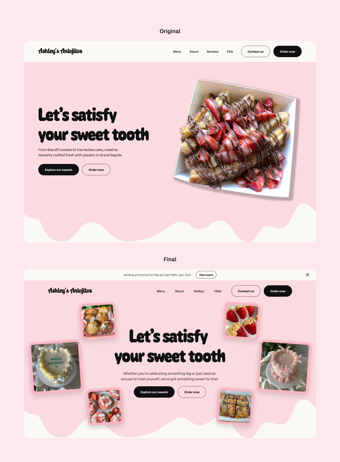
The original hero followed a familiar pattern: headline and body copy on the left, a single product image on the right. Soft launch feedback described it as clean and easy to read, but testers noted the single image felt underwhelming and suggested showing more of the product upfront. Several responses specifically mentioned wanting to see more of what Ashley makes before scrolling.
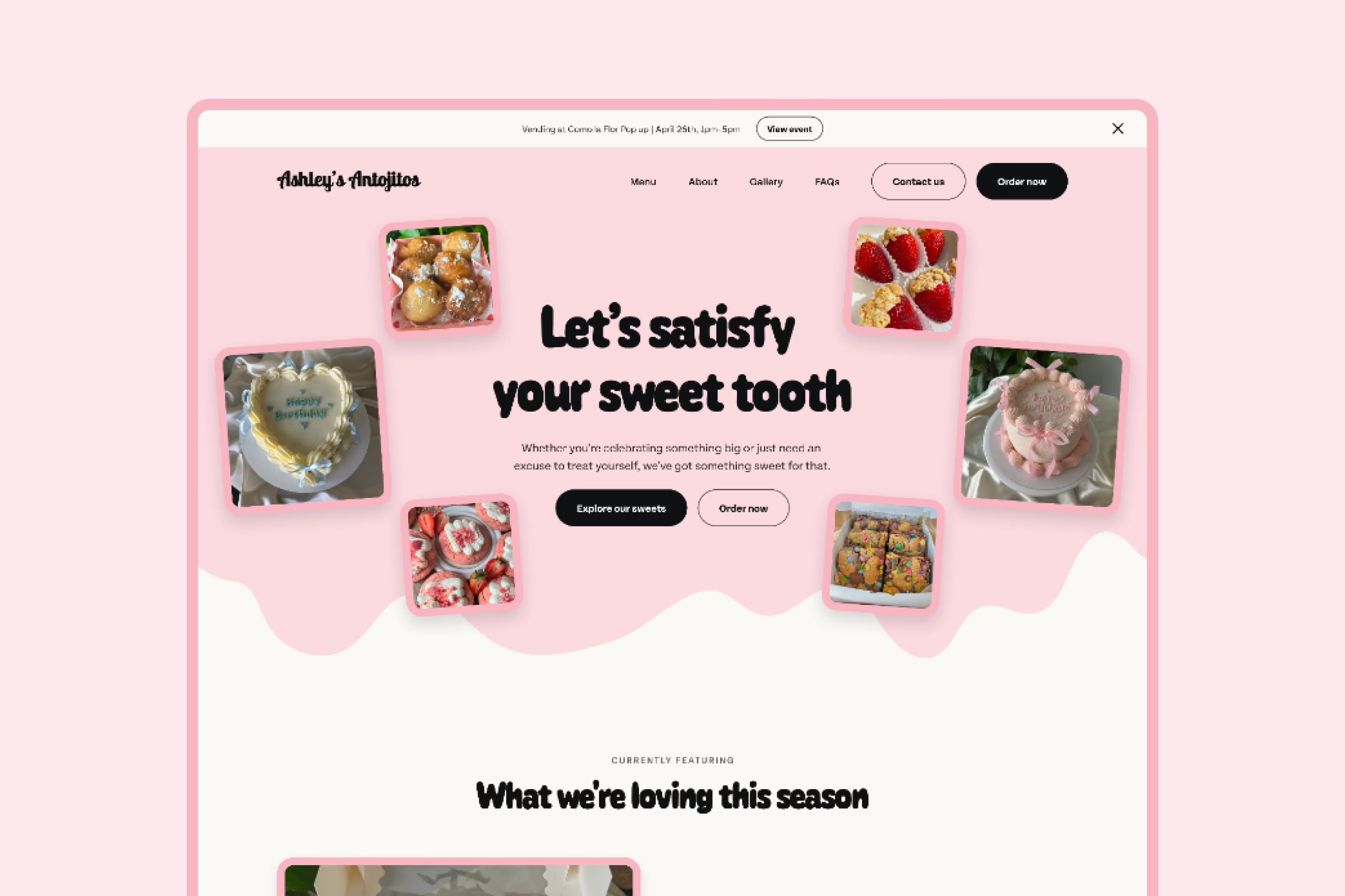
The hero was redesigned around that feedback. Centered headline and CTAs replaced the split layout, with six floating dessert images surrounding the content on desktop and three rotating images above it on mobile. The result gave visitors an immediate visual impression of the range and quality of Ashley's desserts at page load — before they'd scrolled to the menu or featured items. Post-redesign responses described the hero as engaging, vibrant, and different from what testers expected from a small dessert business.
One gap identified for future testing: device type wasn't standardized across testers, making it harder to isolate whether feedback applied to the desktop or mobile experience specifically.
Building for a site that would grow
The Ashley's Antojitos site launched as a single page, but the expectation was that it wouldn't stay that way. Rather than hardcoding values throughout the design file, the project was built with a full variable system covering typography, color, spacing, and border radius — each with responsive values across desktop, tablet, and mobile breakpoints. Components were built from those variables so any future change to the type scale or color palette could be made in one place and cascade through every artboard automatically.
For a small client site, the setup takes more time upfront. The tradeoff is that future additions — new pages, seasonal updates, a rebrand — don't require hunting through individual frames to find every instance of a changed value. It's the same principle that makes design systems worth building at scale, applied to a project small enough that most designers would skip it.
Found in testing, fixed before launch
Three problems surfaced between soft launch and final release. The first was a mobile Safari loading bug — a 4-5 second delay traced to a conflict between Cloudflare Turnstile and Recaptcha running simultaneously. Having both was redundant and was blocking content from rendering. Turning off Recaptcha resolved it immediately.
The second was a scroll anchor bug discovered during user testing. When visitors clicked "Order Now," the page wasn't landing in the right position. The root cause was Y-transforms from scroll animations shifting page positions as elements loaded in — the page height at load was different from the page height after animations fired. Removing scroll animations from everything outside the hero fixed the anchor behavior and was validated by user feedback that the animations outside the hero were more distracting than beneficial.
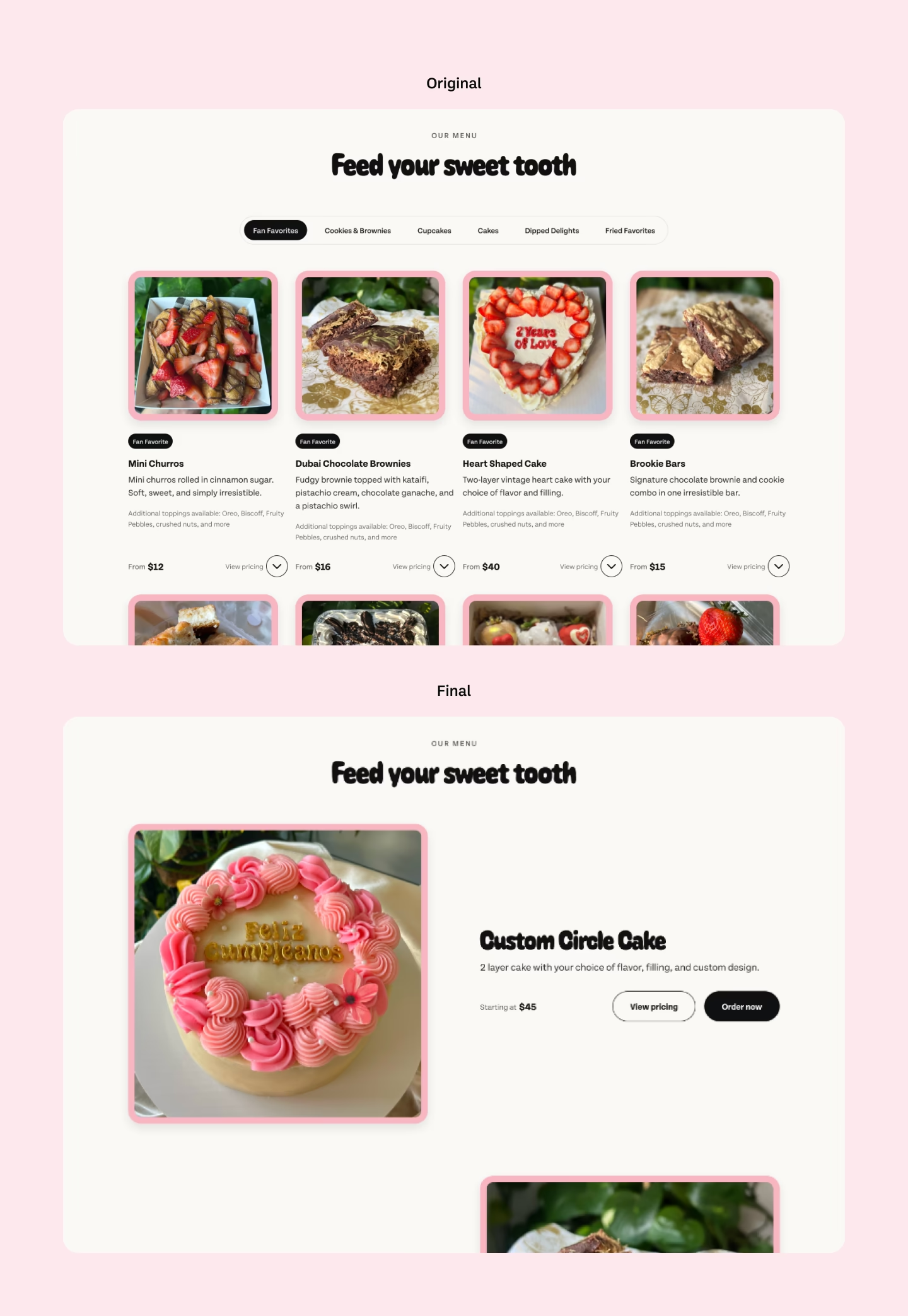
The third was the menu. The original design included three featured items plus a full tabbed menu across six categories — over 40 items total. User testing revealed two problems: page performance slowed under the weight of the full menu, and the volume of choices created decision paralysis. The solution was to keep three featured seasonal items and surface only the ten most popular items in the menu section, with those same ten feeding directly into the order form's item selector.
Built to turn cravings into orders
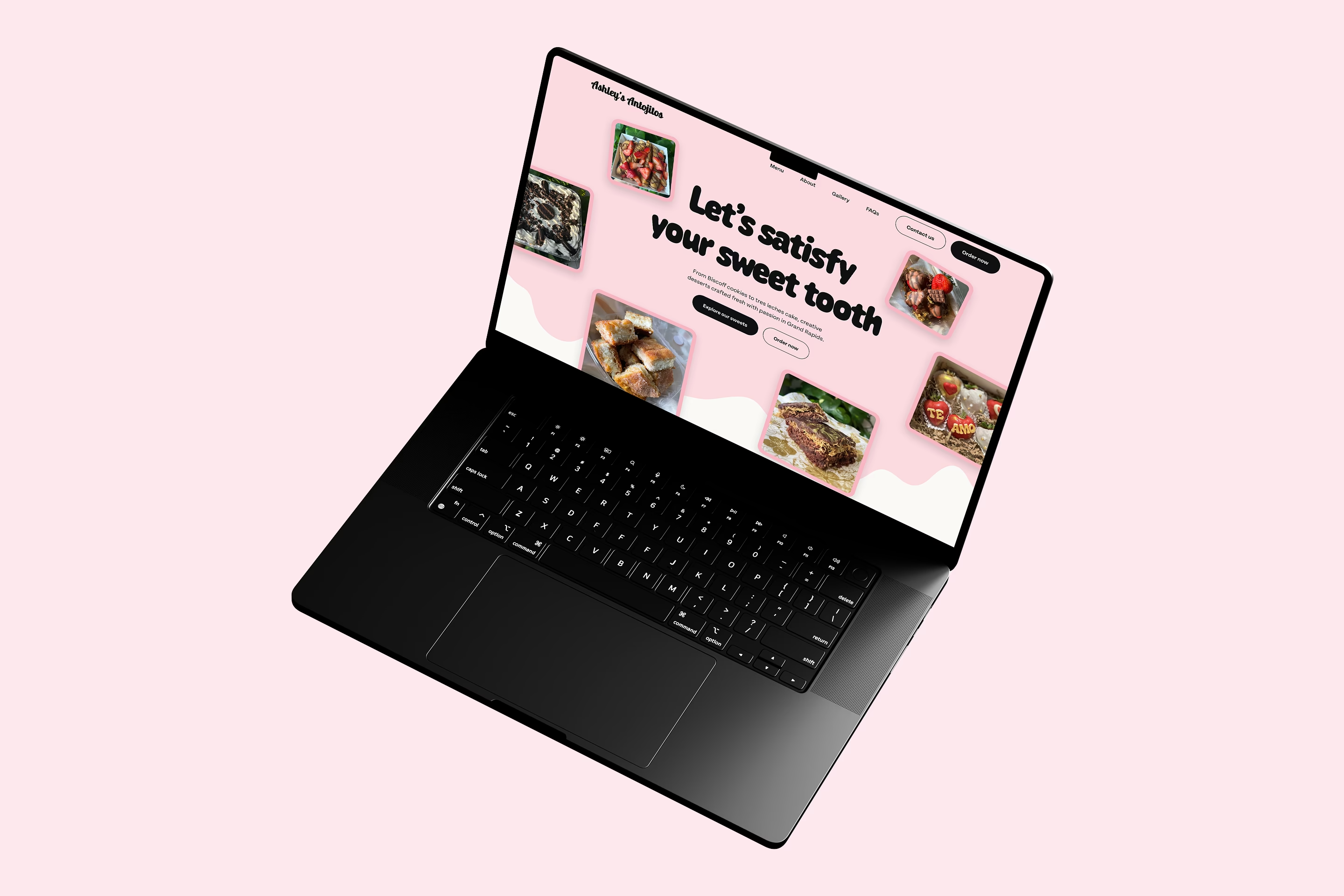
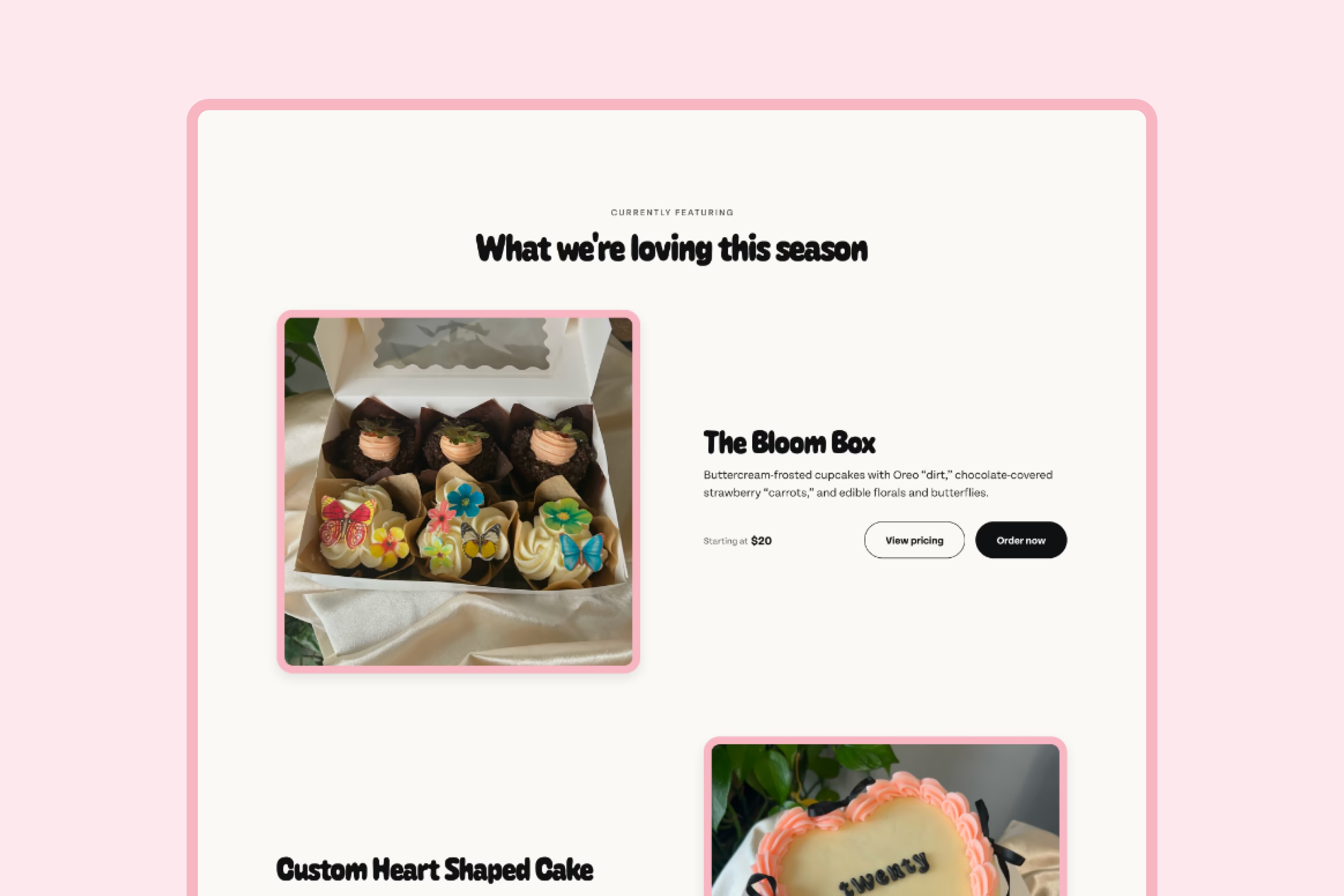
A single-page Webflow site built to convert visitors into dessert orders and catering requests without friction. Featured items and a curated ten-item menu keep choices focused, with vibrant product photography doing the work of making the decision easy.
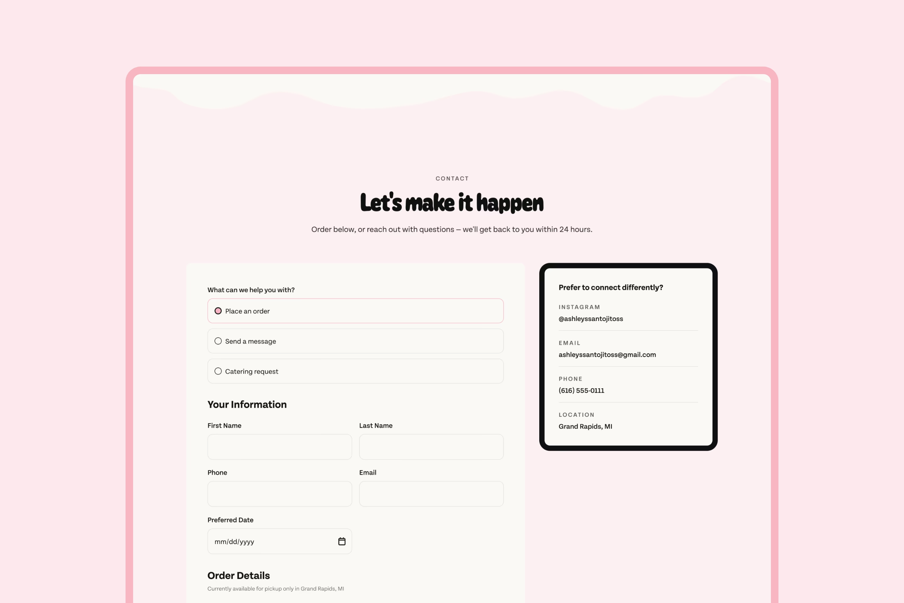
The page is sequenced as a conversion path. The hero hooks visitors immediately with Ashley's desserts and two direct CTAs. Featured items and the menu give them enough to make a decision. Reviews and an about section build the trust needed to order from someone they've never met. The order form — accessible from every CTA on the page — supports multiple items in a single submission and feeds directly into Ashley's workflow.
The result is a site that gives visitors antojitos — little cravings — for whatever Ashley makes next.
From DMs to a dessert destination
Before this project, Ashley's Antojitos lived entirely on social media. Every order required a back-and-forth DM conversation — confirming items, quantities, pickup dates, and pricing manually for each customer. Catering inquiries were even harder to manage with no structured way to capture event details. Since launch, the site has brought in 646 visitors, 50 orders, and 5 catering inquiries — including a 175-guest wedding — with visitors spending an average of three minutes on the page. The order form replaced the entire DM process with a single submission, and the catering form gave the business a professional intake process it didn't have before. What started as a social media presence became a legitimate business destination.